
pareto
Creates a pareto plot and returns the handle of the graphics objects.
Syntax
pareto(y)
pareto(y, x)
pareto(hAxes, ...)
h = pareto(...)
Inputs
- y
- Y values of the dataset. These values are sorted in decreasing order and presented as a bar chart.
- x
- X values of the dataset. If omitted, range 1:length(y) will be used instead.
- hAxes
- Axis handle. .
Outputs
- h
- A 2-element vector. The first value is the handle of the bar chart. The second value is the handle of the Cumulative curve.
Examples
Simple pareto example:Figure 1. Pareto plot
clf;
y = [50 100 25 84 55 10];
pareto(y);
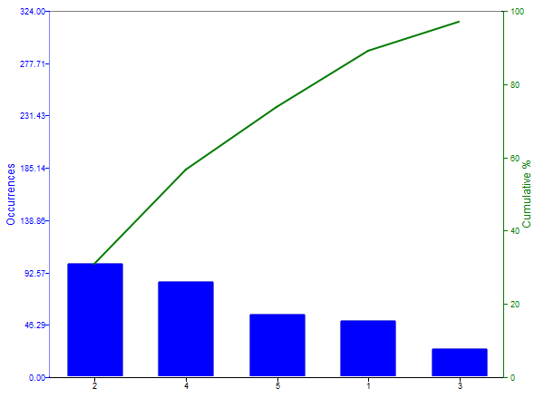
Set x values:Figure 2. Numeric X values

clf;
y = [50 100 25 84 55 10];
x = 10:10:60;
pareto(y, x);Set x values as a cell of strings:Figure 3. String X values
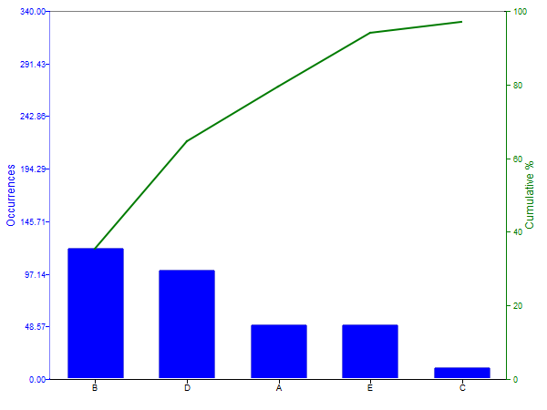
clf;
y = [50 120 10 100 50 10];
x = {'A', 'B', 'C', 'D', 'E', 'F'};
pareto(y, x);Customize the bar chart and line style:Figure 4. Change bar and line style
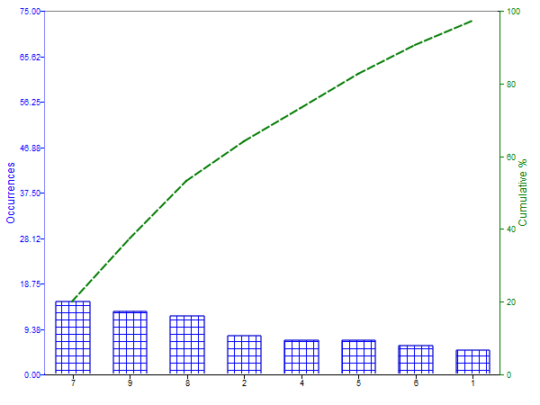
clf;
y = [5 8 2 7 7 6 15 12 13];
h = pareto(y);
set(h(1), 'barstyle', 3);
set(h(2), 'linestyle', '--');Comments
If there is no axis, one is created first.
The pareto plot consists of a bar chart and a line. The bar chart, plotted on the left vertical axis, shows the frequency of occurencies (y) in descending order. The line, plotted on the right vertical axis, presents the cumulative percentage of the total number of occurances.
Note:
Only the values that contribute up to 95% (cumulative percentage) are shown in the plot.