A Pie chart is a pictorial representation of data in the form of a circular chart or
pie, where each slice of the pie represents a category or subset of the data (part of the
whole).
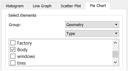
To select elements for a Pie chart:
Select the group of elements.
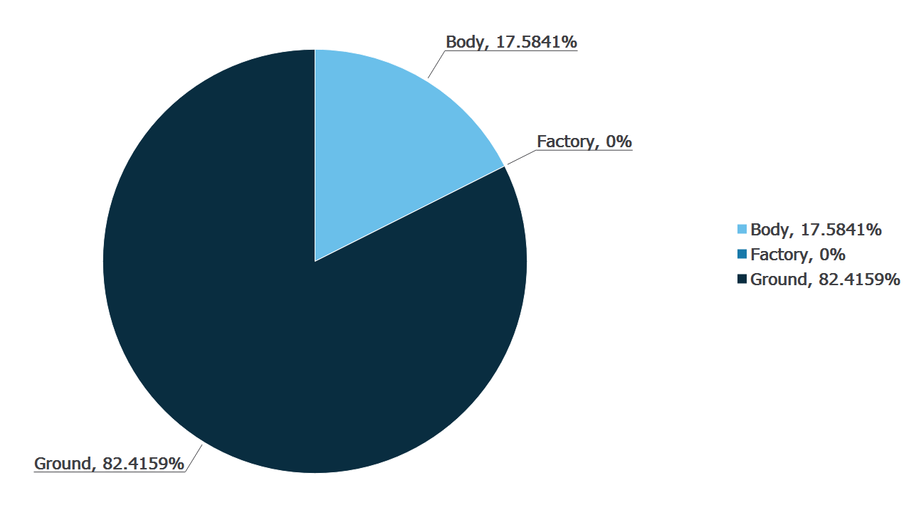
The following Pie chart shows the force on the equipment - broken down by
equipment type in a conveyor simulation. The chute experiences the greatest
force, followed by the feed conveyor.
The amount for each category is proportional to the area of the sector and
the total area of the circle is 100%.
For each element type, you can select to split the data by type or
selection/bin group.
Note:
When you select Type or Selection
Group is selected, the categories within that
selection are listed.
If you select Contacts and then select
Type, all specific contacts are the
categories listed. For example, particle x - particle x, particle x
- particle y and particle y - particle y.
If you select Contacts and then select
Selection groups, all selection and bin
groups in your model are the categories listed.
All categories within a type or group are included in the chart by
default.
Define Attributes
In a Pie chart, you can view the contribution of attribute elements or metrics to
a total by displaying your data in a pie.
To define attributes:
For example, the total mass
of particles of Type A compared to particles of Type B. For more information on
attributes, see Attribute
Definitions.
The following table shows the attributes and
components available for each element.
Click the Select Attribute tab and select the
element attribute and component you want to examine.
The attributes available in the list will depend on the elements
previously selected. You can also select a component type for certain
attributes. The component type available for most attributes is
Total as this is the only component type that can
be displayed using a Pie chart.
The following table shows the attributes and components available for each
element.
Element
Attribute
Components
Contacts
Contact vector 1, 2
Magnitude, X, Y, Z
Normal force
Magnitude, X, Y, Z
Normal overlap
N/A
Number of contacts
N/A
Tangential force
Magnitude, X, Y, Z
Tangential overlap
N/A
Custom property
Depends on the number of elements
Collisions
Average normal force
Magnitude, X, Y, Z
Average tangential force
Magnitude, X, Y, Z
Maximum normal force
Magnitude, X, Y, Z
Maximum tangential force
Magnitude, X, Y, Z
Normal energy loss
N/A
Number of collisions
N/A
Relative velocity
Magnitude, X, Y, Z
Relative velocity normal
Magnitude, X, Y, Z
Relative velocity tangential
Magnitude, X, Y, Z
Tangential energy loss
N/A
Total energy loss
N/A
Velocity of element A
Magnitude, X, Y, Z
Velocity of element B
Magnitude, X, Y, Z
Geometry
Compressive force
N/A
Distance
N/A
Pressure
N/A
Total force
Magnitude, X, Y, Z
Velocity
Magnitude, X, Y, Z
Custom property
Depends on the number of elements
Particle
Acceleration
Magnitude, X, Y, Z
Angular Velocity
Magnitude, X, Y, Z
Aspect Ratio
Magnitude, X, Y, Z
Compressive Force
N/A
Diameter
N/A
Distance
Define reference object*
Frozen
N/A
Kinetic Energy
N/A
Mass
N/A
Mass Scale
N/A
Number of Particles
N/A
Potential Energy
N/A
Rigid Link
N?A
Rotational Kinetic Energy
N/A
Shape
N?A
Shape Scale
Magnitude, X, Y, Z
Torque
Magnitude, X, Y, Z
Total Energy
N/A
Total Force
Magnitude, X, Y, Z
Velocity
Magnitude, X, Y, Z
Volume
N/A
Custom property
Depends on the number of elements
Note:
If the attribute is set to Distance, you must define a point or
plane from which the distance is measured. When you select
Distance, the Define Reference Object
section of the pane will be activated. Select
Point or Plane
and define its position and, for a plane, its distance from the
origin.
Configuring Graph Settings
You can configure the settings for elements in a particular Time Step or over a
range of Time Steps.
To configure settings:
To modify the Current Time Step, use the Current Time control in the Viewer
control pane at the right of the screen.
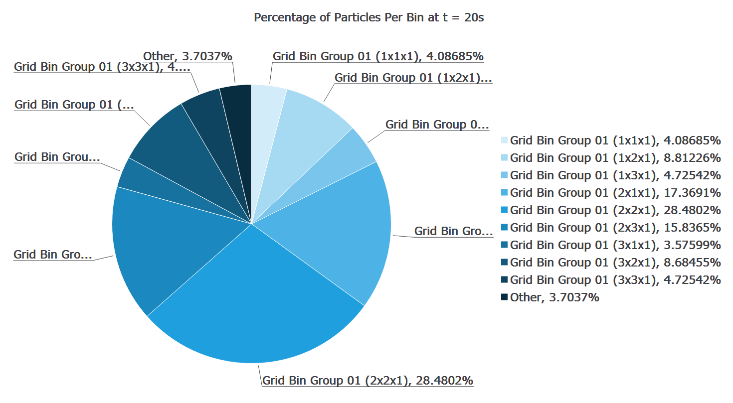
By default, the Current Time Step is selected. For example, you can plot
the total number of particles in each bin in a bin group at a particular
time or the total number that have been in the bins over the course of the
entire simulation. Comparing the charts we can see that at t=20s most
particles are in bins (2x1x1) and (2x2x1). However, this is not indicative
of their location over the course of the whole simulation.
Clear the Current Time Step check box to set a
different Start and End time.
Grayed-out Time Steps indicate partial saves and may not contain all the
data you want to plot.
Specify a title for the chart.
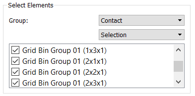
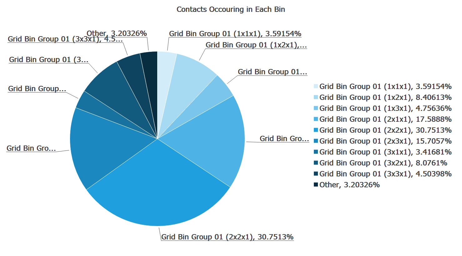
Select Bin Groups
A model contains a bin group that divides the model domain into 10 bins. You may
want to display the number of contacts that are occurring in each bin at a given
time.
To select Bin groups:
Select the element and then navigate to Contact > Selection.
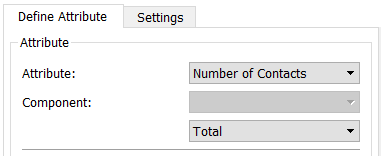
Select Number of Contacts (Total).
In the Settings tab, specify a title for the chart.
In the Viewer Controls pane, select the Time Step at which you want to
examine the contacts.
Note:
In the Settings tab, you must ensure that the
Current Time Step check box is selected.
Click Create Graph.
The Pie chart and the percentage breakdown of the number of contacts
occurring in each bin will be displayed in the Viewer.