Create a Curve from a Measure

  1. From the Home tools, click the satellite icon on the Measure tool.


    Figure 1.
    This launches the Measure Table dialog.
    Figure 2.

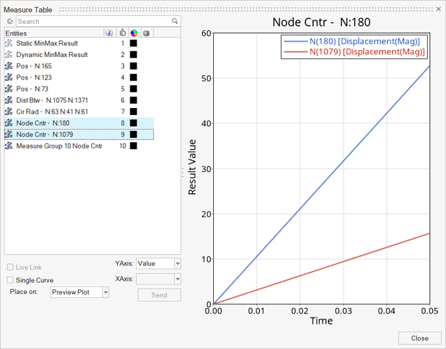
    The bottom left of the dialog has the options to create (or preview) curves from measures.

  2. Preview a measure curve.
    Verify that the Place On option is set to Preview Plot and click on the measure item in the table. This will display the curve on the right-side preview plot window.
    Note: Selecting multiple measures to preview is possible, if the measure items selected have the same axes types. Otherwise, the following message is displayed within the dialog:
    Figure 3.
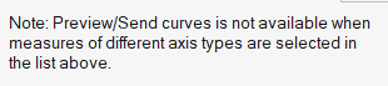
  3. Create a measure curve.
    1. Activate the Live Link check box if you want to establish a link between the selections on the Measure panel and the curve in the HyperGraph window. (Live) is added to the name of the measure item and the curve name to indicate that a live link is established. When a live measure item is deleted, a message is displayed prompting you to keep or delete the curve. When saving a report template with the live link option enabled, the curve is reestablished from a newly specified data file. The curve will be fully updated once a full cycle of animation is completed. A curve that is linked to a measure is updated when a tracking system is applied.
      Note: The Live Link check box is greyed out for the Preview Plot option.
    2. Activate the Single Curve check box to enable the X-axis option. This option is only available for single entity measures. This option is only available for single entity measures such as Position, Relative Displacement, Nodal/Elemental Contour, and Yaw Pitch Roll, and is particularly useful for plotting path measures of discrete selections.
      Note: This option will automatically be activated for all Node Path measures.
      Clicking on the measure curves within the HyperGraph Coordinate Info panel will highlight the entities in the HyperView modeling window.
      In order for the highlighting to work, the curves must be Live linked and they should also be created as either a Single Curve or from a Node Path. This is useful in identifying the entities at min/max of the curves points (see the example below):


      Figure 4. HyperGraph Coordinate Info Panel (with max curve point selected)


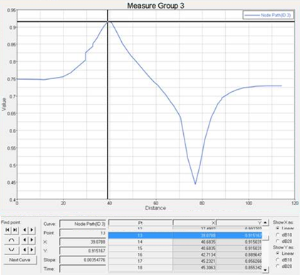
      Figure 5. HyperView Modeling Window (with node highlighted on the model)
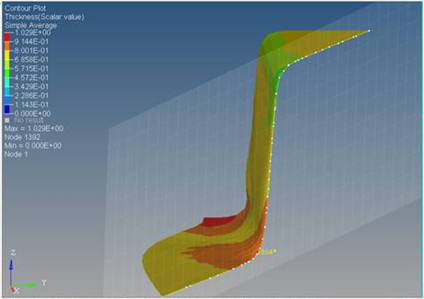
    3. Select the Y-axis for the curve.
      The available options depend on the group measure type.

      Select the X-axis for the curve (if available).

      Note: This option will only be available if the Single Curve option is activated.
    4. From the Place on drop-down menu, select a destination for the curve.
      Option Description
      New window The curve is created in the next available empty window. If no such window exists, then the page layout is changed to the layout with an empty window. If no empty window is found, then a new page is added.
      Existing window The curve is created in an existing plot window that was selected from the page and window tree.
      Y-axis Select a component of a measure to define the Y-axis in the plot.

      The available options depend on the measure group type selected.

      X-axis Select a component of a measure to define the X-axis in the plot. The available options are: Distance, Entity-X, Entity-Y, Entity-Z, or Entity ID.

      With the X-axis option selected, the values of the abscissa of the curve will be updated at every time step for transient results, and at every frame for modal results with complex data.

      The default setting for this option is Distance.

      Note: If you are using the Modal or Linear animation mode with non-complex data, the value will remain constant throughout the period of animation.
    5. Click Send to create a curve in a HyperGraph Window.
      • If New window was selected - a plot is created in a HyperGraph window. The position of the plot in the window is based on the next available page layout.
      • If Existing window was selected - a curve is added to the existing plot in HyperGraph (which was selected in the session tree).
      Note: Bar chart plotting is also available. In order to obtain a bar chart from the measure, you need to pick an existing bar chart window with the Existing window option or have an empty bar chart window available with the New window option. Every curve addition to the bar chart replaces the categories with the selected X-axis option. It is important to make sure that you have consistent categories in the bar chart when overlaying multiple curves. See the HyperGraph User's Guide for additional information.
      Tip: See the Contour Measure Curves topic for a quick way to create curves from this measure.