Handle of a container object, which could be a figure, frame, uipanel, uitab or
uibuttongroup.
Type: double | integer
property, value
backgroundcolor
Specifies the background color. Valid values are transparent or
a real vector specifying RGB values in the range 0-255 or
0-1.
Type: string | vector
celleditcallback
Callback function that is triggered when a value is changed in a cell in
h.
If value is a function handle, it must be a function that takes at least two arguments:
the first is the handle of the uitable, and the second is the
event data to the uicontrol. Twin Activate passes
empty data to the second argument if there is no data to the
uitable.
If value is a string, it must represent a function handle or a function
name.
If value is a cell, it must contain the function name/function handle in the
first cell element and parameters to pass to the callback function in the
additional elements.
Type: cell | functionhandle | string
cellselectioncallback
Callback function that is triggered when cell selection changes.
If value is a function handle, it must be a function that takes at least two arguments:
the first is the handle of the uitable, and the second is the
event data to the uicontrol. Twin Activate passes
empty data to the second argument if there is no data to the
uitable.
If value is a string, it must represent a function handle or a function
name.
If value is a cell, it must contain the function name/function handle in the
first cell element and parameters to pass to the callback function in the
additional elements.
Type: cell | functionhandle | string
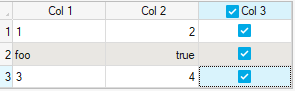
columneditable
Specifies the column(s) which are editable. Valid values are
true(default), false,
or matrix of size (1, n) where m is the number of column(s) with
Boolean value(s) indicating which column(s) are editable.
Type: Boolean | matrix
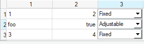
columnformat
Specifies the column formats. The value must be a cell,
specifying values of:
char(left justified data, default)
logical(center justified checkboxes)
numeric(right justified data)
cell(popupmenus with items specified by the cell)
[](default)
For data, of type mtx, this property is
ignored and values are always right justified.
For data, of type checkboxes, icons, popupmenus,
radio buttons or uicontrol, this property is ignored and gui
elements are center justified.
Type: cell
columnname
Specifies the column labels of h. Valid values are
numbered(default) or cell with label
names.
Type: string | cell
columnwidth
Specifies the width of the columns. By default, the value is
auto, where column widths are automatically adjusted.
Individual column widths can be defined in a cell array of size
(1, n), where
n is the number of columns in
data. The values in each of the cells
specify the width of the individual column(s).
Type: cell | string
createfcn
Function that is triggered when h is created. If
value is a function handle, it must be a function that takes
at least two arguments.
The first argument is the handle of the uicontrol. The
second argument is the event data to the uicontrol, which is ignored for
createfcn.
If value is a string, it must
represent a function handle or a function name. If value is a
cell, it must contain the function name/function handle in the first cell element
and parameters to pass to callback function in the additional elements. After it
is being executed, createfcn cannot be interrupted.
Type: cell | functionhandle | string
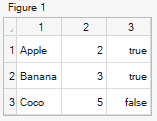
data
Table data. If the data type is cell, the cell elements can
only be one of the following types scalar | integer | Boolean | complex | string.
Scalar values in for a cell data type can also be handles to a uicontrol
widgets of stylecheckbox, radiobutton,
listbox and popupmenu.
Icons can be specified in cell widgets of uitable
using a string of the format '<iconlabel <IMG SRC="iconfile">'.
All icons are center aligned.
Maximum dimensions of data in a uitable
are [1000000 x 16000].
Type: cell | mat
deletefcn
Function triggered when h is deleted. If
value is a function handle, it must be a function that takes
at least two arguments.
The first argument is the handle of the uicontrol. The
second argument is the event data to the uicontrol, which is ignored for
deletefcn. If value is a string, it must
represent a function handle or a function name.
If value is a
cell, it must contain the function name/function handle in the first cell element
and parameters to pass to callback function in the additional elements. After it
is being executed, deletefcn cannot be interrupted.
Type: cell | functionhandle | string
enable
Specifies if h is enabled. Valid values are
on(default) and off.
Type: string
fontangle
Specifies angle of the displayed font. Valid values are
regular(default) and italic.
Type: string
fontname
Specifies name of the displayed font.
Type: string
fontsize
Specifies size of the displayed font.
Type: scalar
fontunits
Determines if fontsize property is absolute or relative based on
fontsize of the parent of handle. Valid values
are pixels (default) or normalized.
Type: string
fontweight
Specifies weight of the displayed font. Valid values are normal
(default) and bold.
Type: string
headerformat
Specifies the format for header labels formats. The value must be a cell,
specifying values of:
char(left justified)
logical(center justified checkbox)
numeric(right justified)
[](center justified default)
Type: cell
interruptible
Specifies if celleditcallback and
cellselectioncallback functions can be interrupted
by clicking on the Stop button in the user interface. Valid
values are off (default) and on.
Type: string
keypressfcn
Function that is triggered when there is a key is pressed on h.
If value is a function handle, it must be a function that takes
two arguments. The first argument is the handle of the uicontrol. The second
argument is the event data to the uicontrol, which has details on the key pressed.
If value is a string, it must represent a function handle or a
function name. If value is a cell, it must contain the function
name/function handle in the first cell element and parameters to pass to the
function in the additional elements.
Type: cell | functionhandle | string
parent
Specifies the parent.
Type: scalar
position
Position and size of h. Value is specified as a vector of
form: [left top width height]. If units has a value of
normalized, values must be between 0 to 1.
Type: vector
rowheight
Specifies the height of the row(s). By default, the value is
auto, where row height(s) are automatically adjusted.
Individual row height(s) can be defined in a cell of size (1,
n), where n is the number of row(s). The values in cell will
specify the height for the individual row(s).
Type: cell | string
rowname
Specifies the row labels of h. Valid values are
numbered(default) or cell with label
names.
Type: string | cell
rowstriping
If on, alternate rows of h will
have a different background color. Valid values are off(default)
and on. This property is available only on Windows.
Type: string
showgrid
Specified if grid is shown for the h.
Valid values are on(default) and off.
Type: string
tag
User-defined string to tag h.
Type: string
tooltipstring
Tooltip.
Type: string
units
Specifies units of measurement. Valid values are
pixels(default) and normalized. Value
pixels indicates that h has a fixed size and
position specified by position.
Value normalized indicates that h will be resized if parent
is resized.
Type: string
userdata
User-defined numerical data.
Type: complex | mtx | scalar
value
User-defined scalar data.
Type: scalar
visible
Specifies if h is visible. Valid values are
on(default) and off.