Tutorial Level: Intermediate In this tutorial, you will learn how to work with the Values and Axes panels, edit curve
attributes, and contour line plots.
From the 3D Chart ribbon, click the Curve Style
tool.Figure 1.
Curve attributes, such as line style, color, and weight as well as symbol style and
color and data attributes, are located on the Curve Attributes panel. Figure 2.
From the 3D Chart ribbon, click the Axes
tool.Figure 3.
Axis attributes such as labels, color, and scaling can also be modified using the
Axes panel.Figure 4.
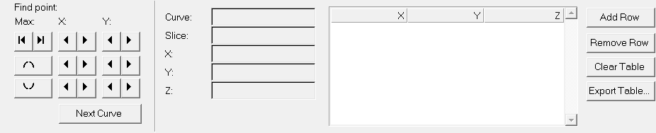
From the 3D Chart ribbon, click the Values
tool.Figure 5.
The Values panel allows you to retrieve individual point data on any curve in the
active window. When a point on a curve is selected, the point data is displayed on
the panel and in a bubble in the graphics area of the screen.Figure 6.
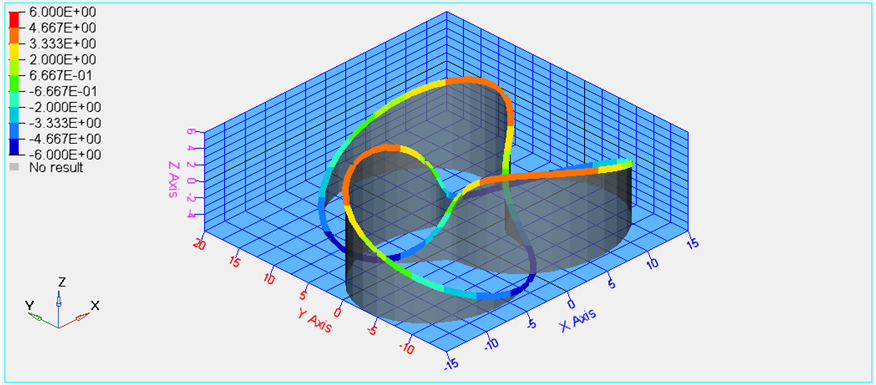
Open Session File
From the menu bar, select File > Session > Open.
Select the file Curve_Attributes_line.mvw, located in the
3dplotting directory, and click Open.
Figure 7.
Work with the Values Panel
From the 3D Chart ribbon, click the Values tool.
Figure 8.
Note: A bubble with the coordinates for the first point of the curve appears in
the grid area.
Click the buttons to move to the next points along the X, Y, and Z axis,
respectively.
Click the buttons to move to the maximum and minimum point on the
curve, respectively.
Work with the Axes Panel
From the 3D Chart ribbon, click the Axes tool.
Figure 9.
Pick a color from the color palette for the X axis.
Click the tabs for the Y and Z axes, respectively, and change the colors of the
respective axis.
Click the Shading tab.
Figure 10.
Verify that the Grid Style: is Box and change the Grid
line color.
Verify that the Axes lengths is set to Automatic.
Check the Lines option for Grid Style.
Change the Background color by selecting a color from the palette.
Figure 11.
Go back to the Box option for Grid Style.
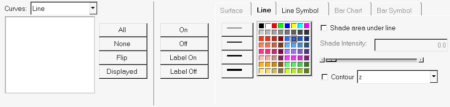
Edit the Curve Attributes and Contour the Plot
From the 3D Chart ribbon, click the Curve Style
tool.
Figure 12.
Verify that the Line tab is active.
Change the line thickness and color by selecting from the panel options.
Figure 13.
Activate the Shade area under line option.
Move the Slider Bar under Shade Intensity to increase the intensity to
0.75.


 to move to the next points along the X, Y, and Z axis,
respectively.
to move to the next points along the X, Y, and Z axis,
respectively.

 buttons to move to the maximum and minimum point on the
curve, respectively.
buttons to move to the maximum and minimum point on the
curve, respectively.