Plot and Edit Polar Plots
Tutorial Level: Beginner In this tutorial, you will learn how to create polar plots from a data file and add polar plots by using mathematical functions.
Click to open the Create Curves by File dialog.
Use the Create Curves by File dialog to constructs multiple curves and plots from a single data file. Curves can be overlaid in a single window or each curve can be assigned to a new window. Individual curves are edited using the Define Curves dialog.
Existing curves can be edited individually and new curves can be added to the current plot using the Define Curves dialog. The dialog also provides access to the program's Expression Builder.
Build a Polar Data Plot from a Data File
- From the menu bar, select to clear the contents of the session.
- Click to open the Create Curves by File dialog.
- Use the file browser button to open the modal_participation.f06 file, located in the plotting folder.
- Leave the Subcase: field set to Subcase 11.
- Leave the Data Type: field set to Frequency.
- From the Type: column, select Modal Participation.
- From the Request: column, select FLUID Node 5417.
- From the Component: column, select Mode 1, Mode 3 and Mode 5.
-
Click Apply to create the polar plots.
The vectors are plotted at a frequency of 100.0Hz.
Figure 3. 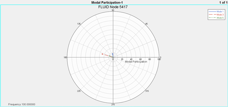
- Access the Frequency dialog by clicking the listed frequency value in the bottom left region of the plot area.
-
Select the 128.0Hz frequency and click
OK.
The vectors are plotted at 128Hz frequency.
Figure 4. 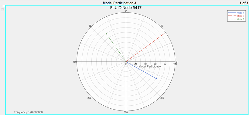
Add Polar Data
-
Use the Page Layout button,
 , to change the window layout of page 1 to a two-window
layout.
, to change the window layout of page 1 to a two-window
layout.
- Activate the window on the right side.
-
Click the Change Type icon (
 )
above the plot window and select Polar Chart.
)
above the plot window and select Polar Chart.
- Enter the Define panel.
- Add a new polar plot curve named Curve 1 by selecting Add R/I.
- Rename Curve 1 to Summation by typing the new name in the Curve: field and pressing the Enter key.
- Under Source, select Math.
-
In the Frequency= field, enter p1w1c1.f.
A frequency field is specified to allow HyperGraph to compute the summation vector for every frequency. In this case, the summation vector can be animated or updated when a certain frequency is chosen.
- Select the Real = radio button and then select Math as the Source.
- In the Real = field, enter p1w1c1.yr + p1w1c2.yr + p1w1c3.yr.
- In the Imaginary = field, enter p1w1c1.yi + p1w1c2.yi + p1w1c3.yi.
- Set the Type: field to Vector Plot.
- Click Apply to create the polar plot.
- Access the Frequency dialog by clicking the listed frequency value in the bottom left region of the right hand side of window 2.
-
Choose the 128.0Hz frequency and click
OK.
The summation vector is now plotted at 128Hz frequency.
Figure 5. 
-
Change the Type: field to Phase vs Mag.
Notice: A Phase vs Magnitude curve for all frequencies is shown as a line connecting the tips of the vectors at different frequencies.
Figure 6. 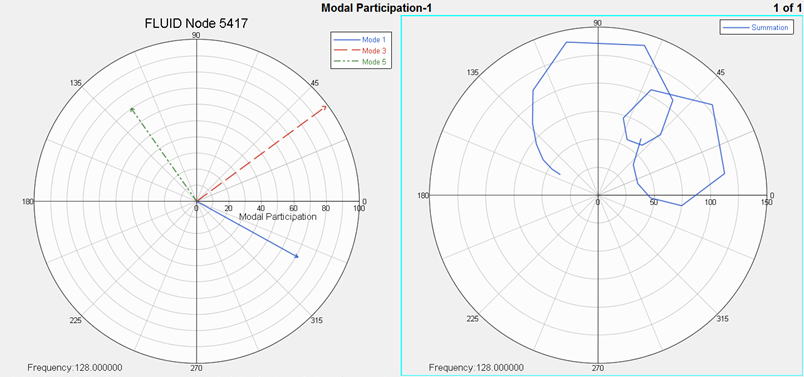
-
Click the start animation button,
 .
Notice: The summation of vectors is updated in the animation for each frequency value in the list.
.
Notice: The summation of vectors is updated in the animation for each frequency value in the list.