
Create a Dashboard Using Data from AnythingDB
With this solution you can see the Data how you want, where you want, and fast enough to act quickly.
This tool is powered by Altair Panopticon and supports a wide range of information
visualizations, including our well-known Treemaps, Heat Maps, Scatter Plots, Horizon
Graphs, and a wide range of other great visualizations designed for fast
comprehension and easy interpretation of static, time series, real-time streaming,
and historic data sets.
Important: To visualize
data stored in the Property History section in AnythingDB or the data stored in
a Category, you will first need to create an App. Otherwise, skip Step 1 and
begin at Step 2.
- From the left menu, click Real-Time Visualization.
- Select the desired folder. By default, a root folder with your username is already present.
-
Click New Workbook.
- Name the Workbook and click Create.
-
Create a Data Table by clicking the + icon.
Data tables define the queries and source data repository definitions, in order to retrieve data.
Figure 1. Data Table tab 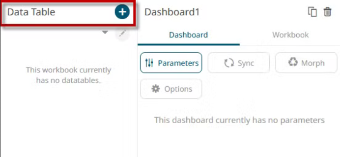
-
For this example, you will use an MQTT Connector. Go to the Streaming section
and select the MQTT option.
Figure 2. Select connector 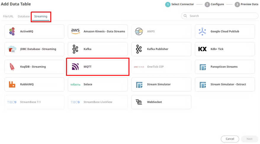
-
Fill in the table information as shown below:
- Name: {Introduce a name for the table}
- BrokerURL: tcp://mqtt.swx.altairone.com:1883
- Topic: spaces/{your_space}/things/{your_thing_id}/properties-history/+
- User Id: {mqtt_user_for_this_thing}
- Password: {mqtt_pass_for_this_thing} Note: You can find the MQTT credentials in Everything → Your_thing → Interfaces → MQTT
-
After completing the information, click on Generate
Columns.
The values generated on the platform will appear at the bottom as shown in the image.
Figure 3. Table Configuration 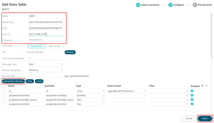
- Click Next.
-
One of the charts that you will use in this demo is a time series chart. To use
it, you must activate the option in the table that was just created. Click on
Edit in the upper corner, then select the table just
created and click Go to Data Table Editor.
Figure 4. Go to Data Table Editor 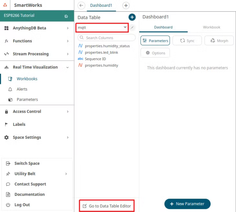
- Go to the Transform settings section.
- Enable Transform to enable the time series analysis option.
- Click Fetch Schema.
-
Save your changes.
Figure 5. Enable time series 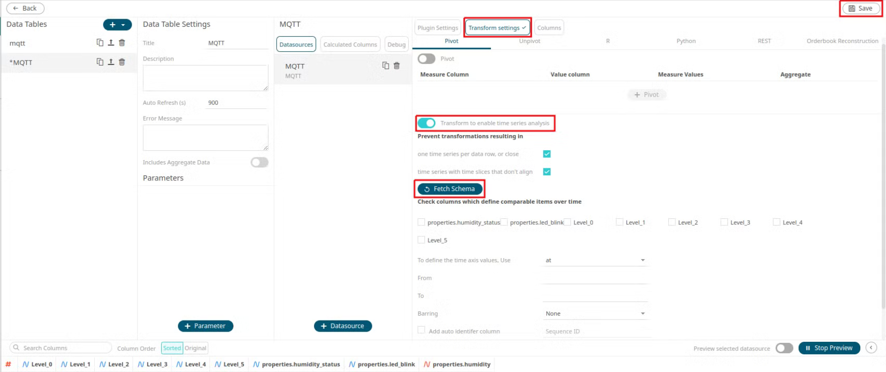
- Click Back to return to the Edit Dashboard view.
- On the blank canvas (right half section), sketch a simple square by clicking and dragging on the blank interface. This enables the Visualization menu.
-
Choose the desired part.
Figure 6. Visualization menu 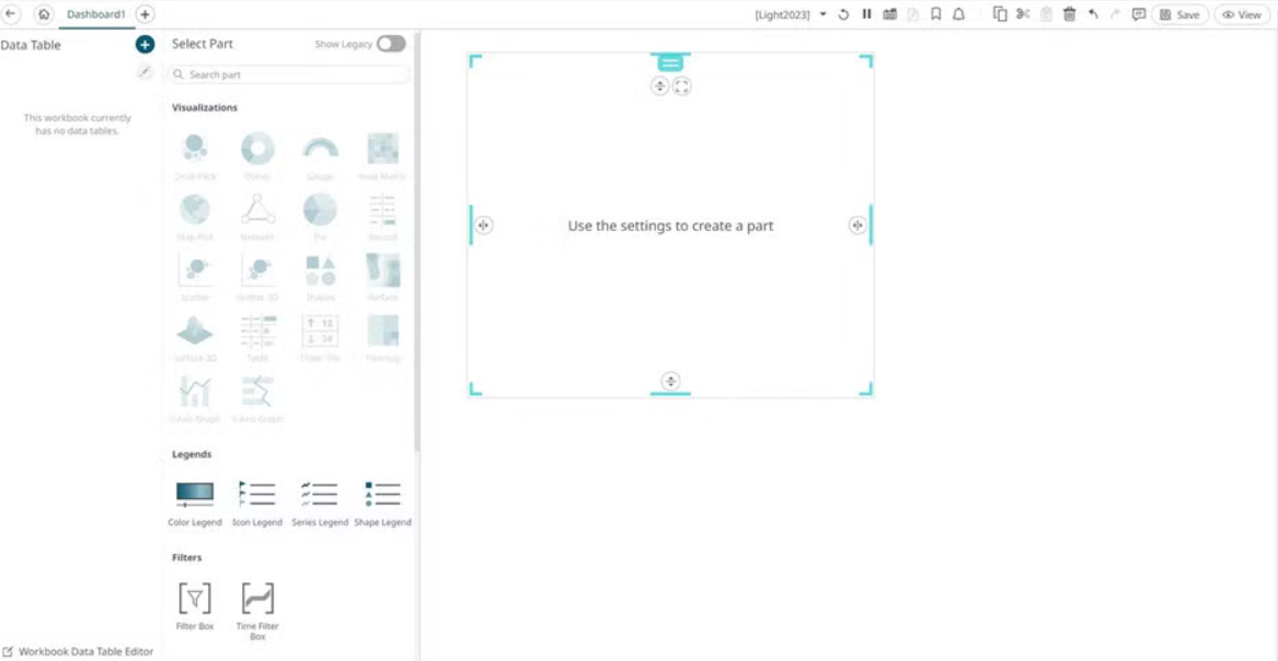
- Save your changes.