
Process and Visualize MQTT Data with Panopticon
Tutorial Level: Intermediate Use Panopticon to process and visualize data sent from Twin Activate using MQTT (Message Queuing Telemetry Transport) protocol.
Prerequesites for This Tutorial
The following software is required for this tutorial:
- Altair Twin Activate
- Altair Panopticon
Files for This Tutorial
MQTT Pub Panopticon.scm, Tutorial Dashboard TwinActivate.exw
Overview
One of Twin Activate's communication protocol options is MQTT, a well-known communication protocol used in IoT (Internet of Things). It is possible to both publish and subscribe to any MQTT broker, local or external, very quickly and lightly.
When publishing messages to a topic, Twin Activate will send data from the software to a MQTT broker, and Panopticon, that is a comprehensive data visualization and streaming analytics tool, will be the client that will subscribe to that broker, process, and visualize the data in real-time:
Among the many capabilities, Panopticon supports native connectors for all common data sources, including SQL and NoSQL databases, big data repositories, flat files, real-time message queues like MQTT and Kafka, and specialized time series databases with no coding or middleware needed.
Also, Panopticon provides a broad range of high-density information visualizations designed to foster intuitive comprehension of complex data. For more information, refer to https://altair.com/panopticon.
General MQTT Setup on Panopticon
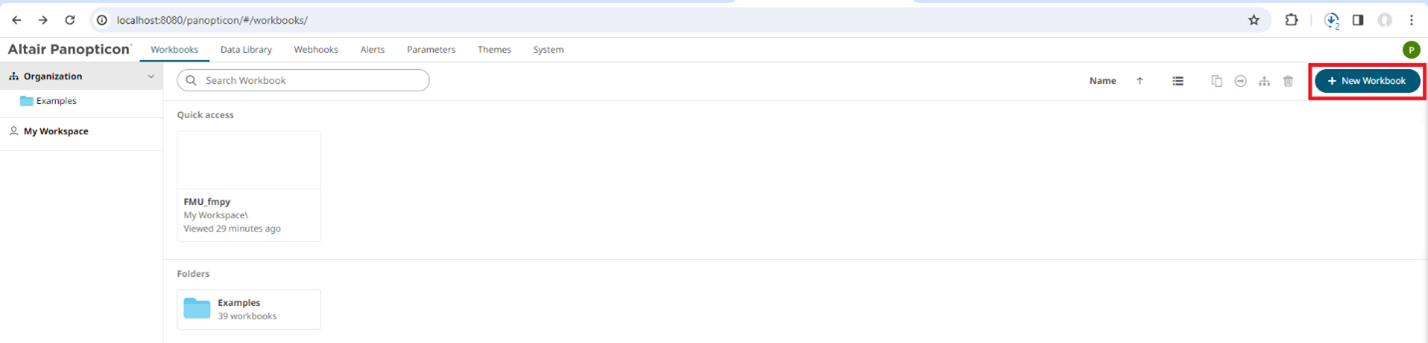
After installing Panopticon, and accessing it on the web, a new Workbook must be created to set the MQTT Connector to receive and process the data:
-
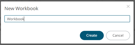
In the Panopticon main page, click New
Workbook, enter a name, and click Create.
-
After creating the workbook, select a Template.
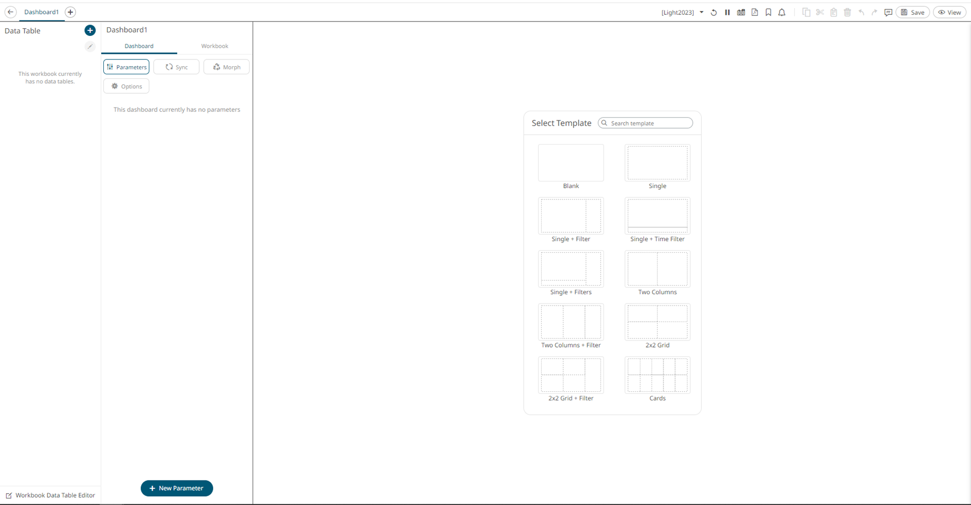
-
Open the Workbook Data Table Editor.
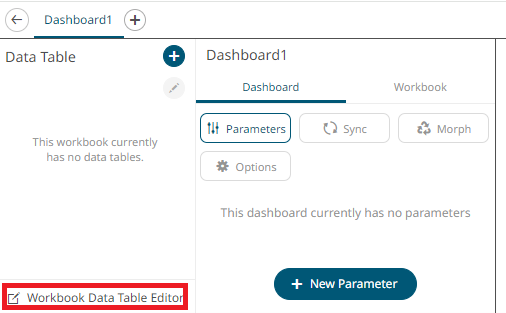
-
Click the + icon to add a new data table.
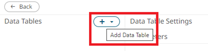
-
After adding a data table, select from the page that opens.
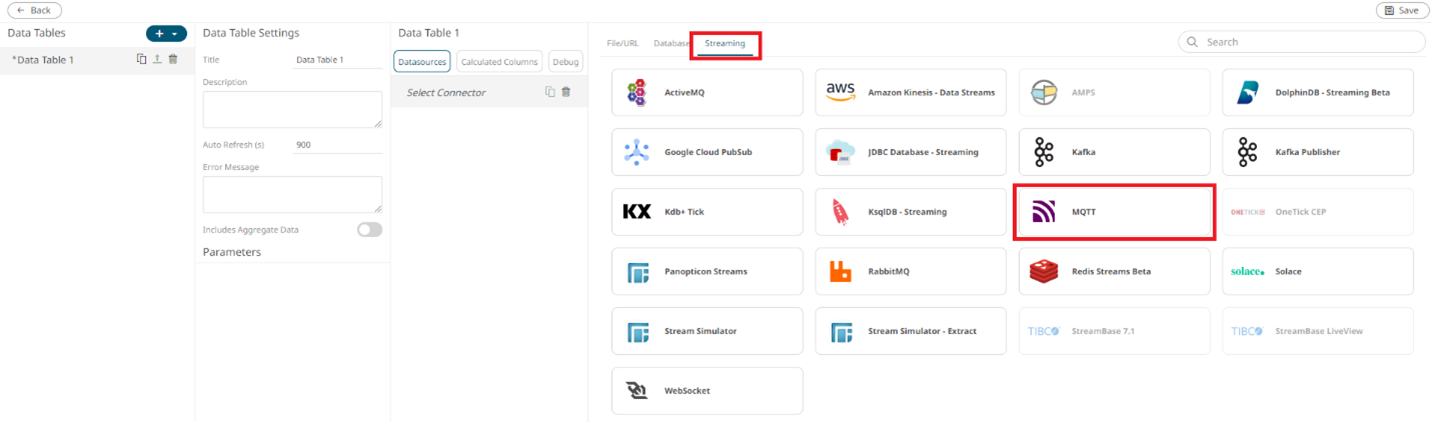
-
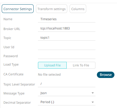
Enter a Topic name, in this case
topic1.
Publish to an MQTT Topic and Visualize Data in Panopticon
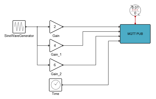
In this tutorial, a standard Twin Activate demo is used, but the process should be the same across any other diagrams. In this case, data will be sent from Twin Activate to a Localhost and Panopticon will visualize that data using MQTT Connector.
- In Twin Activate, select .
-
Open the block's Connection tab. Set the
Hostname and Topic
fields:
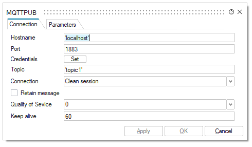
-
Open the Parameters tab. Enter the Number of
Inputs, in this case 3, and the
Message. It is a good practice to use JavaScript
Object Notation (JSON) format to send data to Panopticon:
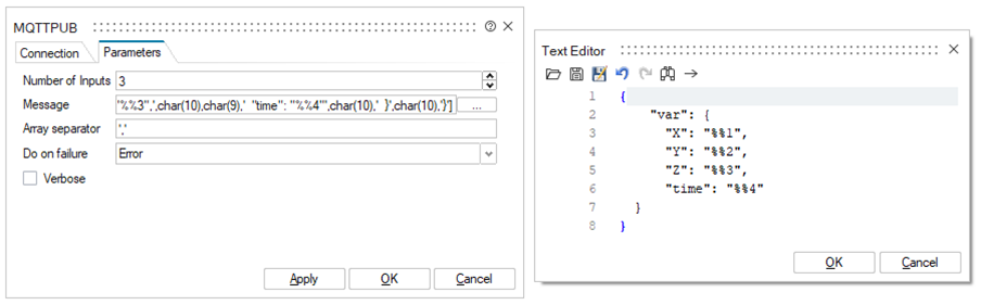
{ "var": { "X": "%%1", "Y": "%%2", "Z": "%%3", "time": "%%4" } } -
After doing the setup for the MQTT PUB block, connect some of the Signal
Generator blocks to the inputs, a Gain for each of them, and a SampleClock to
activate the block:
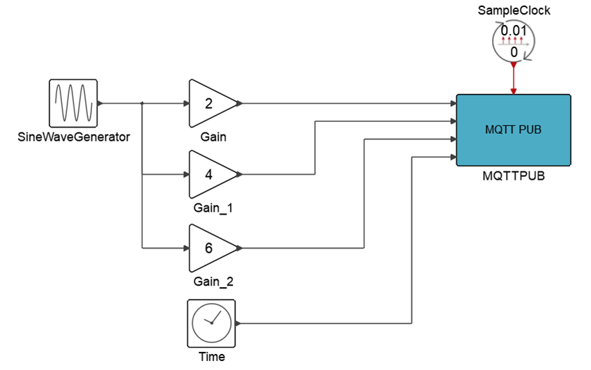
-
Open , and set Real time scaling equal to
1. The simulation will send data in real time to the
localhost.
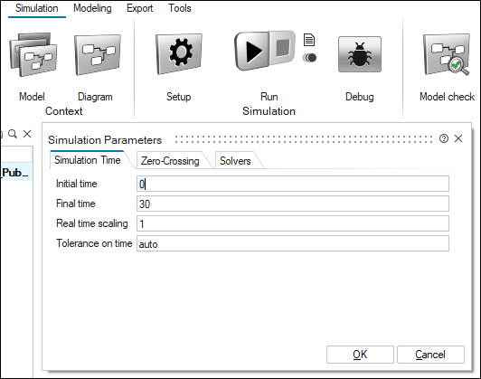
- Click Run Simulation.
-
While the Twin Activate simulation is running, go to
Panopticon and select Generate
Columns.
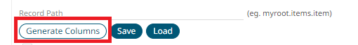 Note: If Twin Activate is not running and sending data, selecting Generate Columns will generate an error.
 -
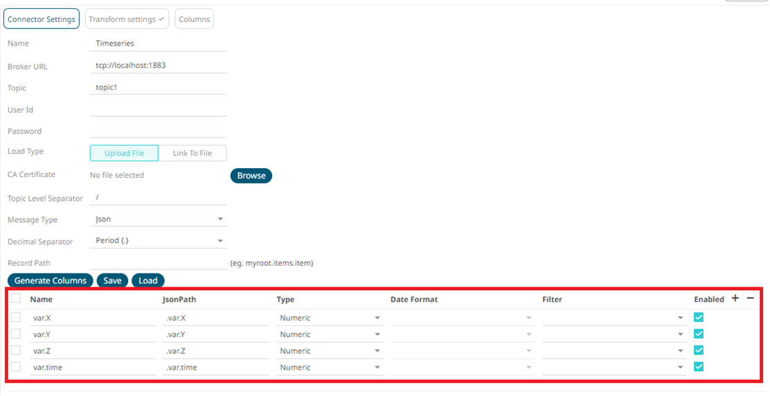
On Panopticon, after generating columns, these
parameters are shown automatically:
-
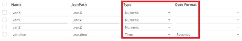
In this tutorial time variable was intentionally sent from Twin Activate, to be used in Panopticon as the time to be plot. Change the
Type to Time, and Date Format
to Seconds.
-
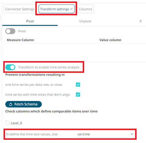
On the Data table editor, enable this analysis to time series. Open
Transform settings. Enable Transform to
enable time series analysis, and select
var.time to define the time axis:
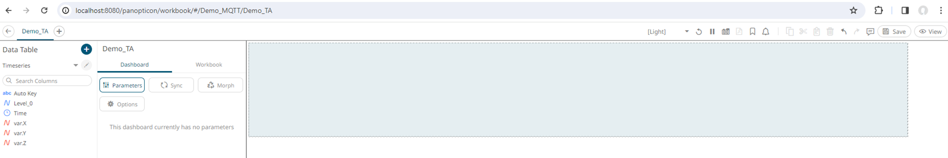
- Save all changes and click Back to return to the Workbook page.
-
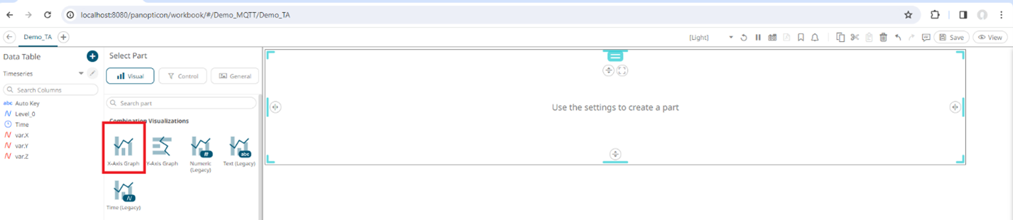
Press and hold in a certain area:
-
Select X-Axis Graph.
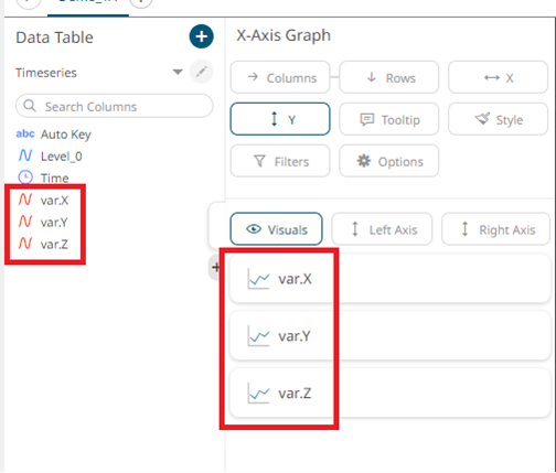
-
Drag and drop X, Y, and Z variables to Y option.
-
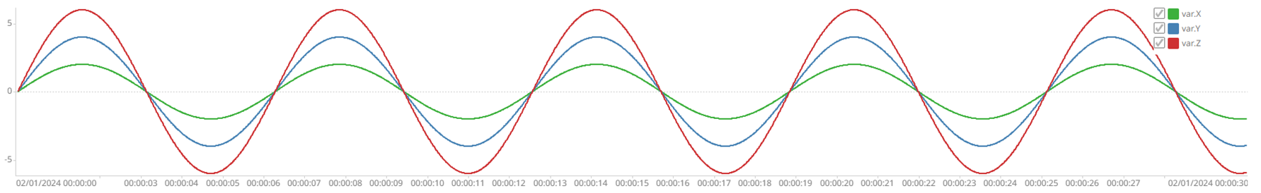
Select View and send data again from Twin Activate to visualize your data in real-time.

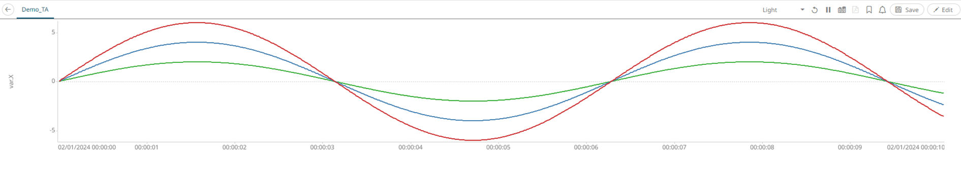
You can import a finished version of this dashboard using the Tutorial Dashboard TwinActivate.exw file inside the main page.
Panopticon is a tool with several available options to create customized dashboards, and there are focused tutorials for that. This is an example showing how to start using both tools together.