The Part Types Pane
The Part Types pane has five sections to define the settings of the dashboard visualization or part.
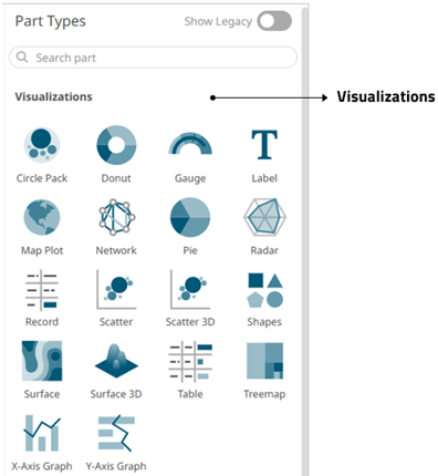
Displays the visualizations you can use. For the legacy visualizations, see Displaying the Legacy Visualizations.

Allows you to link legends to visualizations using drag and drop commands. Four types of legend are supported: Timeseries, Color, Icon, and Shape.
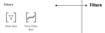
Allows you to filter data to highlight outliers, patterns, and trends. Filters must be populated with data columns for them to function.
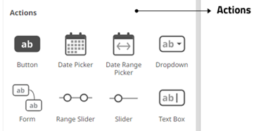
Allow actions to be executed against pre-defined selections and can be used to provide inputs to filtered data sets.
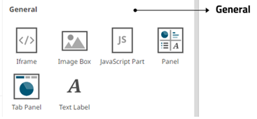
The General section allows you to define the following parts:
| Part | Description |
|
These can be completely independent of your data. Add labels and explanatory text to help users better understand how to use a dashboard using text boxes. Or link them up to a data column for dynamic displays. |
|
|
Allows resizing of the visualizations in a dashboard. |
|
|
Allows a web page to be displayed within a dashboard or page. |
|
|
These are also independent of your data. Add logos or other graphics to your dashboards using Image Boxes. |
|
|
Allows the designer of a workbook to include a bespoke JavaScript code inside a dashboard. |
|
|
Supports a tabbed panel within a dashboard where visuals can be assigned to each tab. |
Once you have items from the Select Part pane on the dashboard canvas, you can move them around, resize or remove.
(c) 2013-2025 Altair Engineering Inc. All Rights Reserved.