Adding a Filter Box
Dashboards specific filters can be applied by adding and populating a filter box which is a container for numeric and categorical (text) filters.
You can add multiple filter boxes to a single dashboard.
- After double-clicking or drawing a rectangle on the dashboard canvas, scroll to the Filters section of the Part Types pane and select Filter Box
 .
.
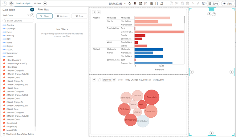
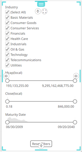
The Filter Box Settings pane is displayed, and the Filter Box part is added on the dashboard canvas.
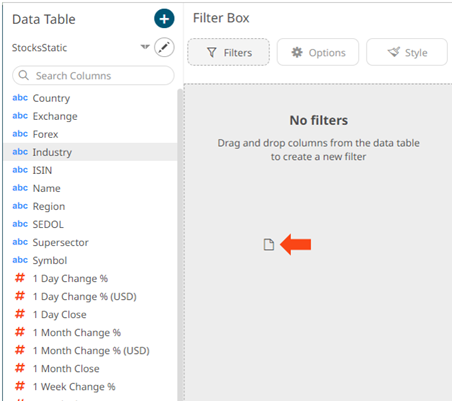
- Drag and drop columns (text, numeric, time, or time series) from the Data Table pane to this area:
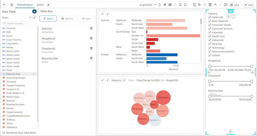
The columns are added under the Filter Box columns list and the filter box is populated by the default filter mode type of the added columns:
- Multiple Selection for text columns
- Numeric Range for numeric and timeseries columns
- Date/Time Range for time columns
- To continue configuring the filter settings, click
 .
.
- Enter the filter box Title then click
 .
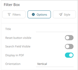
. - You can also set the following options:
- Reset Button Visible
Tap the slider to turn it on and display a reset button at the bottom of the filter box.
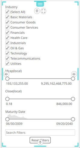
- Search Field Visible
Tap the slider to turn it on and display a search field, to limit the number of displayed filters at the bottom of the filter box.

- Display in PDF
Tap the slider to turn it on and include the filter box in the PDF output.
- Reset Button Visible
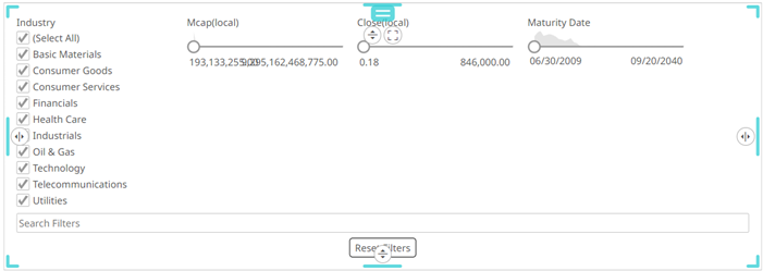
- The Orientation of the filter box can either be:
- Vertical (Default)
- Horizontal
The filter width can be configured in two ways:
- Dynamic
The filters will take the available space.

- Fixed
The input Width will be applied to available filters. Default is 200.
This is an example for width that is set to 180.
- Dynamic
- Vertical (Default)
-
To set the style of the Filter Box, click Style
 .
.The page updates to display the Style pane.
See Defining the Style of General Parts for more information.
For the Filter Box, there are additional properties to set:
- Filter Settings
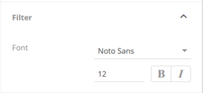
You can set the filter’s Font type, size, and style (Bold and/or Italic).
- Title Settings
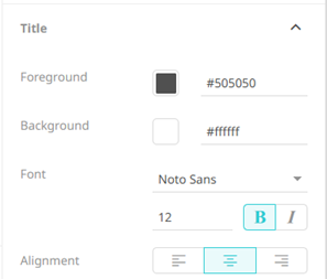
You can set the title’s Foreground and Background colors, Font type, size, and style (Bold and/or Italic), and the Alignment.
- Filter Settings
- Click Update Style
 and select any of the following options:
- Set current as default – Save the changes and set it as the default.
- Create custom style – Save the changes and set it as a custom style.
The Style pane updates to display the Title control.
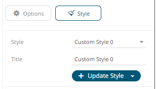
- Enter the custom style's Title.
- If there are additional changes made, click Update Current Style in the Update Style drop-down.
The new custom style is added to the Workbook > Theme > Custom Styles list.
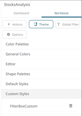
If published, the custom style configuration of the filter box will be added to the Global custom styles list and can be applied to other parts.
- Reset to default – Revert to the original default settings.
When a filter is applied,
 filter icons appear to the right of the filter column title and on the toolbar of the dashboard. Clicking will remove the filter.
Also, Show Active Filters
 icon displays on the toolbar. This allows viewing of all the active filters on the dashboard and its visualizations.
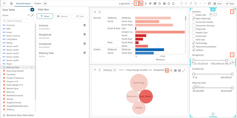
- Click the Save
 icon on the toolbar to save the changes.
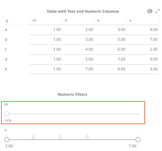
NOTE: Adding a numeric column with the same values on the filter box will be displayed but the slider is in a fixed position with the single value (NA) at the bottom. This filter is collapsible. For example:
(c) 2013-2025 Altair Engineering Inc. All Rights Reserved.