uicontrol
Creates interactive graphical control objects in a figure. Use the 'style' property of uicontrol to create different types of control objects.
Syntax
h = uicontrol()
h = uicontrol(property, value, ...)
h = uicontrol(parent, property, value, ...)
Inputs
- parent
- Handle of a container object, which could be a figure, frame, uipanel, or uibuttongroup.
- property, value
-
- 'aspectratio'
- Specifies if the aspect ratio for 'backgroundimage' needs to be ignored ('off') or kept ('on'). Default value is 'off', and the 'backgroundimage' is resized to the dimensions of h. Valid only for style types pushbutton, togglebutton and frame.
- 'backgroundcolor'
- Specifies the background color. Valid values are 'transparent' or a real vector specifying RGB values in the range 0-255 or 0-1.
- 'callback'
- Callback function that is triggered when interacting with h. If value is a function handle, it must be a function that takes at least two arguments. The first argument is the handle of the uicontrol. The second argument is the event data to the uicontrol. OML passes empty data to the second argument if there is no data to the uicontrol. If value is a string, it must represent a function handle or a function name. If value is a cell, it must contain the function name/function handle in the first cell element and parameters to pass to callback function in the additional elements.
- 'createfcn'
- Function that is triggered when h is created. If value is a function handle, it must be a function that takes at least two arguments. The first argument is the handle of the uicontrol. The second argument is the event data to the uicontrol, which is ignored for createfcn. If value is a string, it must represent a function handle or a function name. If value is a cell, it must contain the function name/function handle in the first cell element and parameters to pass to callback function in the additional elements. After it is being executed, createfcn cannot be interrupted.
- 'deletefcn'
- Function that is triggered when h is deleted. If value is a function handle, it must be a function that takes at least two arguments. The first argument is the handle of the uicontrol. The second argument is the event data to the uicontrol, which is ignored for createfcn. If value is a string, it must represent a function handle or a function name. If value is a cell, it must contain the function name/function handle in the first cell element and parameters to pass to callback function in the additional elements. After it is being executed, createfcn cannot be interrupted.
- 'enable'
- Specifies if h is enabled. Valid values are 'on'(default) and 'off'.
- 'fontangle'
- Specifies the angle of the displayed font. Valid values are 'regular'(default) and 'italic'.
- 'fontname'
- Specifies the name of the displayed font.
- 'fontsize'
- Specifies the size of the displayed font.
- 'fontunits'
- Determines if fontsize property is absolute or relative based on fontsize of the parent of handle. Valid values are 'pixels' (default) or 'normalized'.
- 'fontweight'
- Specifies the weight of the displayed font. Valid values are 'normal'(default) and 'bold'.
- 'horizontalalignment'
- Specifies the horizontal alignment of the text in styles edit, text and textbox. Valid values are left(default), right, center and justify.
- 'keypressfcn'
- Function that is triggered when there is a key is pressed on h. If value is a function handle, it must be a function that takes at least two arguments. The first argument is the handle of the uicontrol. The second argument is the event data to the uicontrol, which has details on the key pressed. If value is a string, it must represent a function handle or a function name. If value is a cell, it must contain the function name/function handle in the first cell element and parameters to pass to the function in the additional elements. text and frame styles of uicontrol do not support 'keypressfcn'.
- 'max'
- Defines the maximum value of h. By default, it is 1. For the 'listbox' style, set the value to greater than 1 to enable multi-selection.
- 'interruptible'
- Specifies if the callback associated with h is interruptible by the user by clicking on the Stop button in the user interface. Valid values are 'off' (default) and 'off'.
- 'min'
- Defines the minimum value of h. By default, it is 0. For the 'listbox' style, set the value to greater than 1 to enable multi-selection.
- 'orient'
- Specifies the orientation of style slider. Valid values are horizontal (default) and vertical.
- 'parent'
- Specifies the parent.
- 'position'
- Position and size of h. Value is specified as a vector of the form [left top width height]. If 'units' has a value of 'normalized', values must be between 0 to 1.
- 'string'
- Text to be displayed on h.
- 'style'
- Property of uicontrol for creating different types of control
objects. Valid values for this property are:
- 'buttongroup'
- Creates a group which can be used to manage related radio buttons.
- 'checkbox'
- Creates a checkbox. By default, if there is a string associated with a checkbox, the string has the focus and a checkbox can be toggled using it.
- 'edit'
- Creates a single line text editor.
- 'textbox'
- Creates a multi-line text editor. A key combination of SHIFT + ENTER will result in a new line in the editor. A key press of just ENTER will trigger the callback function.
- 'frame'
- Creates a frame, which can be used as a parent when creating uicontrol objects to group them. This is similar to the uipanel.
- 'listbox'
- Creates a list box.
- 'popupmenu'
- Creates a popup menu.
- 'pushbutton'
- Creates a button if no 'style' is specified. A uicontextmenu can be attached to this style, where a context menu is displayed with a right-mouse click.
- 'radiobutton'
- Creates radiobuttons.
- 'slider'
- Creates a slider to select an integral value from a range.
- 'text'
- Creates a label.
- 'togglebutton'
- Creates a toggle button. A uicontextmenu can be attached to this style, where a context menu is displayed with a right-mouse click.
- 'waitbar'
- Creates a progress bar.
- 'tag'
- User-defined string to tag graphical control objects.
- 'tooltipstring'
- Tooltip to display.
- 'units'
- Specifies units of measurement. Valid values are 'pixels' (default) and 'normalized'.
- 'userdata'
- User-defined numerical data.
- 'value'
- Current value of h.
- 'verticalalignment'
- Specifies the vertical alignment of the text in styles edit and text. Valid values are top, bottom and middle (default).
- 'visible'
- Specifies if h is visible. Valid values are 'on' (default) and 'off'.
Outputs
- h
- Handle of the uicontrol.
Examples
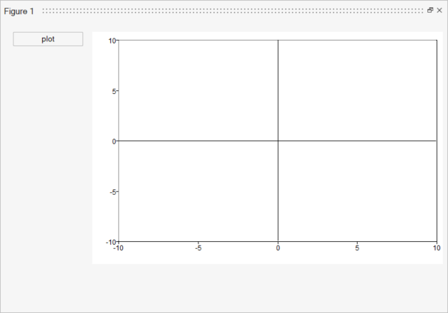
close all;
figure('units', 'normalized', 'position', [0.25 0.25 0.5 0.5])
axes('units', 'normalized', 'position', [0.2 0.05 0.8 0.8]);
uicontrol('units', 'normalized', 'position', [0.02 0.05 0.16 0.05], 'string', 'plot', 'callback', @plot_rnd);

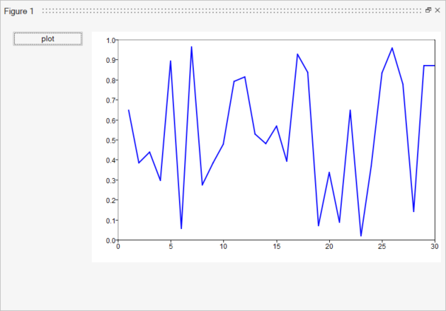
function plot_rnd(handle, callbackdata)
	plot(rand(1, 30));
	disp(handle);
end
Figure 1.
  Figure 2.
    close all;
    classdef callback_demo
        methods
            function cal_method(this, handle, data, varargin)
                display('Button is clicked - class method')
            end

            function init_gui(Self)
                handles.fig = figure('position',[600 400 300 300]);
                handles.ptb = uicontrol(handles.fig,'style','pushbutton','string','Button','units','normalized','position',
                [0.25 0.25 0.5 0.25],'callback', @(src, event)cal_method(Self, src, event));
            end
        end
    end

    inst = callback_demo;
    callback_demo.init_gui();
  classdef callback_demo < handle

	methods
		function cal_method(self, handle, data, varargin)
			display('Button is clicked - class method')
        end

		function init_gui(self)
			handles.fig = figure('position',[600 400 300 300]);
			handles.ptb =uicontrol(handles.fig,'style','pushbutton','string','demo_button','units','norm','position',
			[0.25 0.25 0.5 0.25],'callback', @(src, event)self.cal_method(self, src, event));
		end
	end
end

inst = callback_demo;
callback_demo.init_gui();
Comments
When setting the value of 'style', a short form can be used as long as there is only one match for it. For example, 'pop' can be set for 'popupmenu'.