
Block Category: Signal Producer
Description: The button block lets you dynamically insert signal values during a simulation.
You can set the number of states that a button block has from 2 – 16. You can also associate a bitmap with any of the states. The button block toggles between white and red if it is a 2-state button and there are no bitmaps associated with it.
The button block also provides cycle through, pie area, pushbutton horizontal, and vertical hit testing.
Note: If the bitmap images become distorted, use Edit > Reset Bitmap Scaling to correct their appearance.

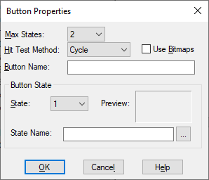
Button Name: Indicates a name for the button block. The name appears only when there is no bitmap associated with the block.
State: Indicates the state to which a name or bitmap is to be applied.
State Name: Indicates the name or bitmap to be applied to the state. To associate a bitmap with a state, activate Use Bitmaps. If you do not know the location of the bitmap, click … to locate and select it. A picture of the selected bitmap appears to the Preview window.
Cycle: Causes the state to increase by 1 each time you right-click the block. When the maximum state value is reached, the next mouse click changes the state back to 0.
Horizontal: Divides the block into a number of horizontal wedges equal to the number of states. When you right-click a particular wedge or when you drag over the button block, the state changes. State 0 corresponds to the leftmost wedge; state N corresponds to the rightmost wedge.
Pie: Divides the block into a number of pie-shaped wedges equal to the number of states. When right-click a particular wedge or when you drag over the button block, the state changes. States advance in a clockwise direction with State 0 at the top.
Push Button: Activates state 1 while you hold down the mouse button. When you release the mouse button, it activates state 0. Push Button hit testing only supports a two-state button block.
Vertical: Divides the block into a number of vertical wedges equal to the number of states. When you right-click a particular wedge or when you drag over the button block, the state changes. State 0 corresponds to the bottom wedge; state N corresponds to the top wedge.
Max States: Indicates the number of states for the button block. The maximum allowable states is 16. The number of listed states in the States box is determined by the value entered in Number of States.
Use Bitmaps: When activated, lets you associate a bitmap with the selected state. To make an association:
1. From the States box, select a state.
2. In the State Name box, enter the bitmap name to be associated with the state. If you do not know the name or location of the file, click … to locate and select it. A picture of the selected bitmap appears in the Preview window.