qqplot
Create a quantile-quantile plot.
Syntax
qqplot(X)
qqplot(X, Y)
qqplot(X, dist)
qqplot(X, dist, param1, param2, ...)
h = qqplot(...)
[q,s] = qqplot(...)
[h,q,s] = qqplot(...)
Inputs
- X
- A data sample with which to compare Y or a specified distribution.
- Y
- A data sample with which to compare X.
- dist
- A distribution name with which to compare X (default: norm).
- paramX
- The parameters for dist (default: none, for standard normal).
Outputs
- h
- A handle for the plot.
- q
- The quantile values on the horizontal axis.
- s
- The sorted input data on the vertical axis.
Examples
Compare a Chi-squared sample with 50 degrees of freedom to the normal distribution with mean 50 and standard deviation 10.
rand('seed', 2023);
n = 100;
data = chi2rnd(50,n,1);
qqplot(data, 'norm', 50, 10);
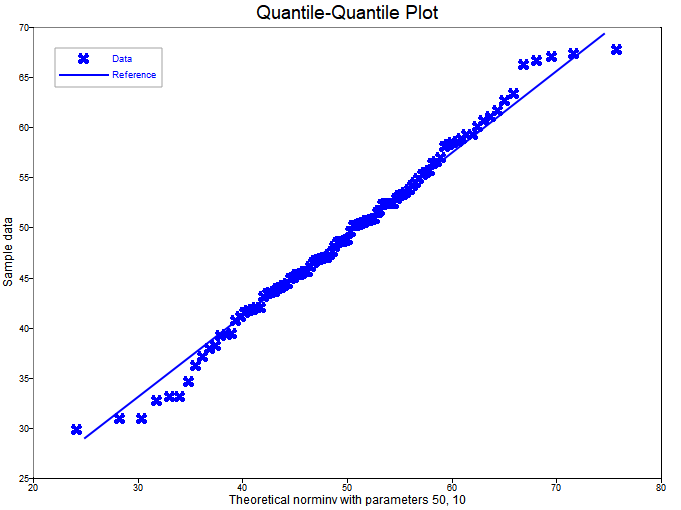
Figure 1. qqplot
Comments
The function plots the empirical quantiles of X on the vertical axis, with either the empirical quantiles of Y or the theoretical quantiles of the specified distribution, dist, on the horizontal axis. The quantiles are selected so that for N points the cumulative probabilities are ([1:N] - 1/2) / N.
If the two quantile sets have the same distribution then the plot is expected to fall on a straight line. The function also plots a line that passes through the first and third quantile points to provide a visual straightness reference.