


|
Define the Default Style Settings of a Theme
When you define the default settings of a theme, you specify the colors and fonts of the workbook, parts, visualizations, filter box, action part title, legend title, and action form.
Steps:
1. To define the default styles of the workbook, click Workbook on the Default Styles tab. The Workbook Settings are displayed.
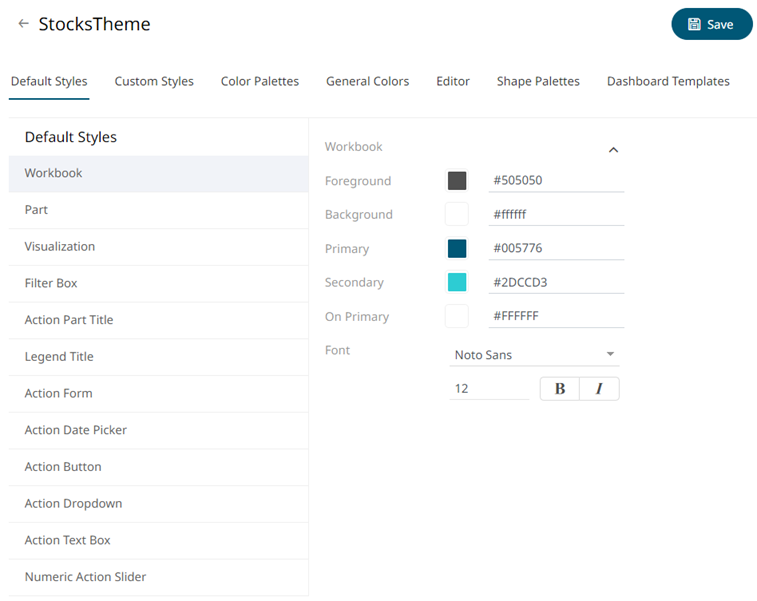
You may opt to modify the colors of the following properties:
|
Property |
Description |
|
Foreground |
Foreground color of the workbook. |
|
Background |
Background color of the workbook. |
|
Primary |
Primary color of the workbook. |
|
Secondary |
Secondary color of the workbook. |
|
On Primary |
Foreground color within the primary color. |
1.1. You can either:
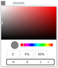
¨ click the corresponding Color box to display the Color dialog to:
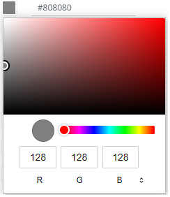
o select the color, or
o click to enter the values
for RGB
for HSL
for the Hex color code
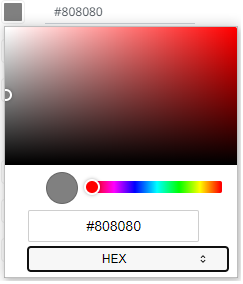
¨ or enter the Hex color code

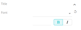
1.2. Select the Font.
|
NOTE |
The available custom fonts in Panopticon Real Time can be selected in the Font drop-down list. |
1.3. Specify the Font Size.
1.4. Specify whether Bold and Italic.
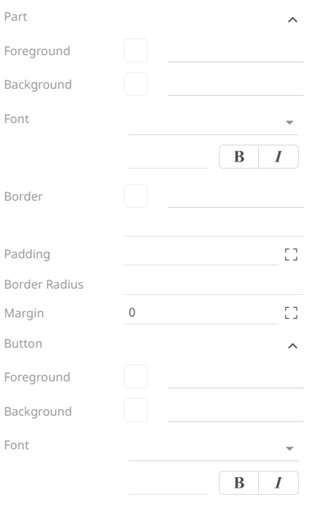
2. To define the default styles of the parts, click Part on the Default Styles pane. The Part Settings are displayed.
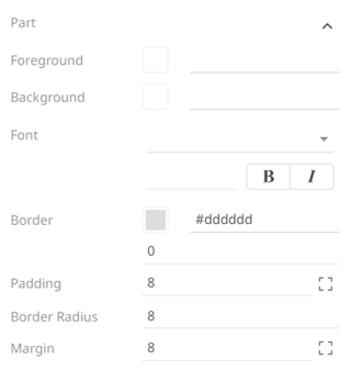
You may opt to modify the colors of the following properties:
|
Property |
Description |
|
Foreground |
Foreground color of the parts. |
|
Background |
Background color of the parts. |
|
Border |
Border color of the parts. |
2.1. Follow step 1.1 to define the visualization, title, and border colors.
2.2. Select the part’s Font.
2.3. Specify the part’s Font Size.
2.4. Specify whether Bold and Italic.
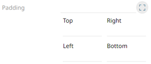
2.5. Specify the Padding of the parts.
2.51. To
modify the Top, Right, Left, and Bottom
padding values, click  .
.
The page updates to display the following fields:
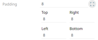
2.5.2. Set the desired padding values. If the values are not the same, Mixed is displayed in the Padding field.
2.6. Specify the Border Radius. When set to 0px, the border is displayed as a sharp corner. Setting to higher values makes the border more rounded.
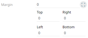
2.7. Specify the Margin of the parts.
2.7.1. To define the Top, Right, Left,
and Bottom margin values, click .
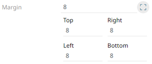
2.7.2. Set the desired margin values. If the values are not the same, Mixed is displayed in the Margin field.
3. To define the default styles of the visualizations, click Visualization on the Default Styles pane. The Visualizations Settings are displayed.
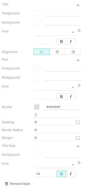
You may opt to modify the colors of the following properties:
|
Property |
Description |
|
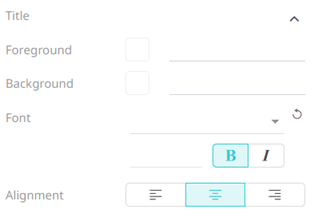
Foreground |
Foreground color of the visualizations and title. |
|
Background |
Background color of the visualizations and title. |
|
Border |
Border color of the visualizations. |
3.1. Follow step 1.1 to define the visualization, title, and border colors.
3.2. Select the visualization and title's Font.
3.3. Specify the visualization and title's Font Size.
3.4. Specify whether Bold and Italic.
|
NOTE |
For the part title, Bold is selected by default. |
3.5. Specify the Border Size of the visualizations.
3.6. Select the visualization title's Alignment, Left, Center, or Right.
3.7. Specify the Padding of the visualizations.
3.7.1. To
modify the Top, Right, Left, and Bottom
padding values, click .
The page updates to display the following fields:
3.7.2. Set the desired margin values. If the values are not the same, Mixed is displayed in the Padding field.
3.8. Specify the Border Radius. When set to 0px, the border is displayed as a sharp corner. Setting to higher values makes the border more rounded.
3.9. Specify the Margin of the parts.
3.9.1. To define the Top, Right, Left,
and Bottom margin values, click .
3.9.2. Set the desired margin values. If the values are not the same, Mixed is displayed in the Margin field.
3.10. You can opt to define the settings of the Title Rows.
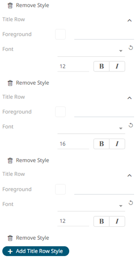
By default, there are three title rows. You can do one of the following:
¨ Click  to delete, or
¨ Click  to add more title rows and define their
settings.
to add more title rows and define their
settings.
4. To define the default styles of the filter box, click Filter Box on the Default Styles pane. The Filter Box Settings are displayed.
You may opt to modify the colors of the following properties:
|
Property |
Description |
|
Foreground |
Foreground color of the filter box. |
|
Background |
Background color of the filter box. |
4.1. Follow step 1.1 to define the colors of the filter box.
4.2. Select the filter box title's Font.
4.3. Specify the filter box title's Font Size.
4.4. Specify whether Bold and Italic.
|
NOTE |
For the filter box title, Bold is selected by default. |
4.5. Select the filter box title's Alignment: Left, Center, or Right.
5. To define the default styles of the action part title, click Action Part Title on the Default Styles pane. The Action Part Title Settings are displayed.
5.1. Select the action part title's Font.
5.2. Specify the action part title's Font Size.
5.3. Specify whether Bold and Italic.
|
NOTE |
For the action part title, Bold is selected by default. |
6. To define the default styles of the legend title, click Legend Title on the Default Styles pane. The Legend Title Settings are displayed.
6.1. Select the legend title's Font.
6.2. Specify the legend title's Font Size.
6.3. Specify whether Bold and Italic.
|
NOTE |
For the legend title, Bold is selected by default. |
7. To define the default styles of the different actions (i.e., Action Form, Action Date Picker, Action Button, Action Dropdown, Action Text Box, Numeric Action Slider), click one and on the Default Styles pane to display their corresponding settings.
Most of these actions share the same settings as below:
You may opt to modify the colors of the following properties:
|
Property |
Description |
|
Foreground |
Foreground color of the action, button, or slider. |
|
Background |
Background color of the action, button, or slider. |
7.1. Follow step 1.1 to define the colors of the actions.
7.2. Select the action and button’s Font.
7.3. Specify the action and button’s Font Size.
7.4. Specify whether Bold and Italic.
|
NOTE |
For the action form, Bold is selected by default. |
7.5. Specify the action’s border color and size.
7.6. Specify the Padding of the actions.
7.6.1. To modify the Top, Right,
Left, and Bottom padding values, click .
The page updates to display the following fields:
7.6.2. Set the desired padding values. If the values are not the same, Mixed is displayed in the Padding field.
7.7. Specify the Border Radius. When set to 0px, the border is displayed as a sharp corner. Setting to higher values makes the border more rounded.
7.8. Specify the Margin of the actions.
7.8.1. To define the Top, Right, Left,
and Bottom margin values, click
.
7.8.2. Set the desired margin values. If the values are not the same, Mixed is displayed in the Margin field.
8. Proceed to the Custom Styles tab to specify the custom styles of the theme.