Time Combination Settings (Legacy)
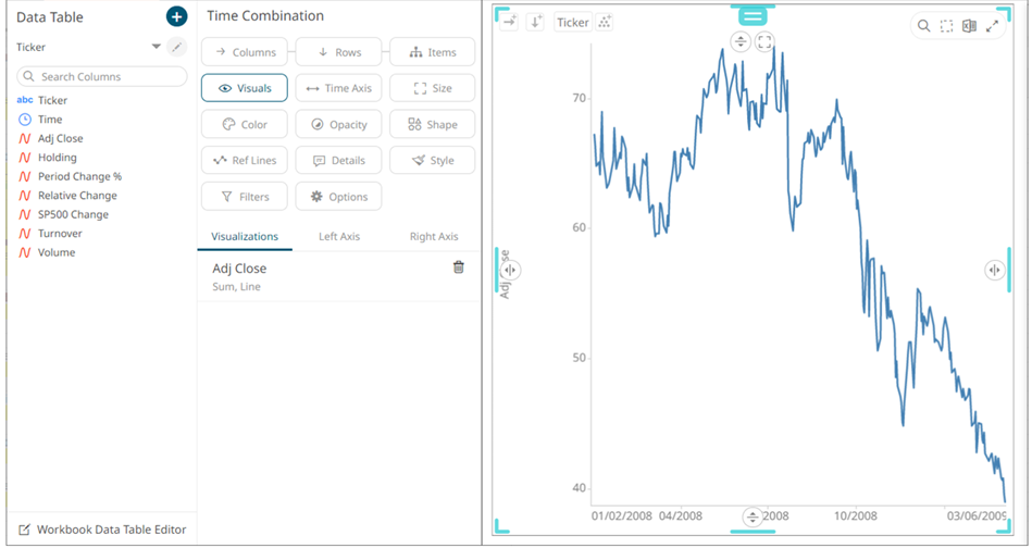
The Time Combination visualization operates in a similar way to the table. Instead of multiple input variables becoming different columns in a table, they become different layers in the time series combination visualization. So, unlike other visualizations, it can display a large number of time series variables, which can be rendered as: Line, Candle Stick, Bar, OHLC, Spread, Stack and Stacked Bar.
- The time combination settings pane is displayed after clicking the Options
 button or the Visualization Title (i.e., Time Combination):
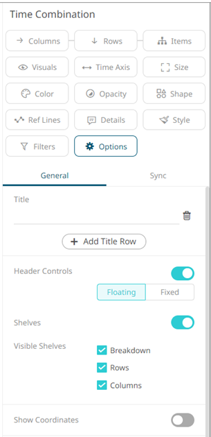
- Set the following property:
Setting Description Show Coordinates
Determines whether the graph coordinates (i.e., X-Y plots, or Date/Time-Y plots) on mouse over are displayed in the visualization. Tap the slider to turn it on.
- Drag and drop time series columns from the Data Table pane to the Visuals variable drop area.
The column is added under the Visualizations tab list and by default, uses the Line graph and the Left Y-Axis alignment to the time combination visualization.
NOTE: The settings of the time combination visualization will depend on the time series visualization that will be added. Refer to the corresponding Settings section to define their properties.
- The properties that you can set will depend on the timeseries visualization that you will add, but the general settings include:
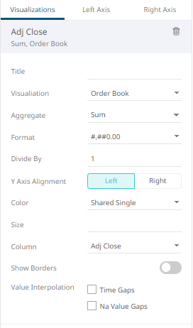
Set or select the following properties:
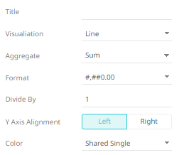
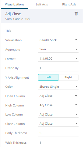
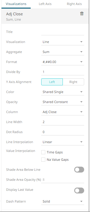
Setting Description Title
Title of the visualization.
Visualization
If the visualization is incorrect, instead of deleting, you can just select another one in the Visualization drop-down list. The settings pane will be changed to display the corresponding properties of the selected visualization.
Aggregate
Aggregation method to be used. Default is Sum.
Format
The format that numbers will be displayed in. Panopticon uses the same formatting rules as MS Excel.
Divide By
Select the Divide By value to divide a number:
-
1
-
1000 (by a thousand)
-
10000
-
1000000 (by a million)
-
1000000000 (by a billion)
Y Axis Alignment
The Y-Axis alignment: Left or Right.
Color
The Color variable that will be used for the column:
-
None
-
Shared Single
-
Custom Single
-
Column added to the Column variable
Column/Value Column
The timeseries column used for the visualization. If the dragged column is incorrect, instead of deleting, you can just select another column in the Column/Value Column drop-down list.
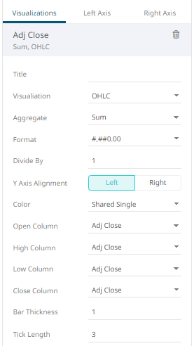
NOTE: For the OHLC and Candle Stick Graph visualizations there are: Open Column, High Column, Low Column, and Close Column.
-
- Visual members can be set to display any of the following visualizations:
- Candle Stick or OHLC
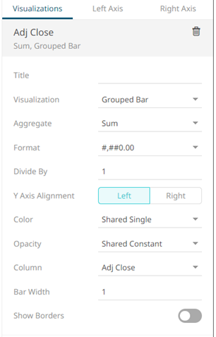
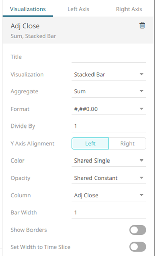
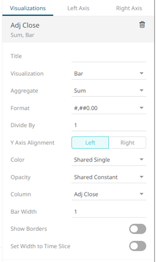
- Grouped, Stacked or Standard Bar
- Line Graph
- Scatter Plot
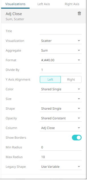
Setting Description Size
Select the Size variable that will be used.
Shape
Select the Shape value.
Alpha
Select the Alpha value.
- Spread
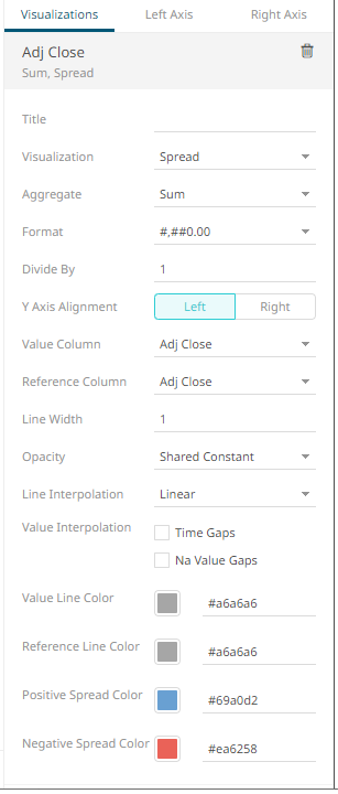
Setting Description Reference Column
The field that will be used as the reference line data series.
- Price Band
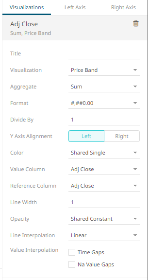
Setting Description Reference Column
The field that will be used as the reference line data series.
- Order Book
- Candle Stick or OHLC
- The time combination visualization includes an expanded axes pane, which includes specification of the properties for both the Left and Right Y axes.
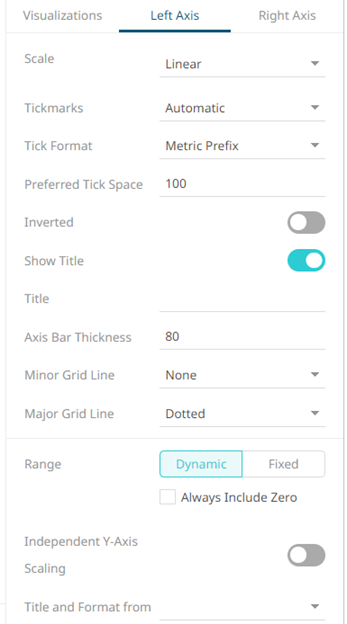
Select or specify the following properties:
Setting Description Scale
Determines whether the scale of the axis is Linear, Log, or Power.
-
Linear – a change between two values is based on addition e.g., 30, 60, 90, 120, 180, etc.
-
Log - a change between two values is perceived on the basis of the ratio of the two values or based on multiplication.
Once selected, the Base control displays the value of the common base for the logarithmic scale (i.e., 10).
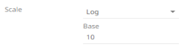
For example: log10(x) represents the logarithm of x to the base 10 e.g., 1, 10, 100, 1000, etc.
You can opt to enter a new Base value then click
 .
.NOTE: Value cannot be lower than 2.
-
Power – Works according to the SIGN(MEASURE)*LOG10(MAX(1, ABS(MEASURE))) formula. Works like the Log scale except it can handle negative values and every value between -1 and 1 is set to 0.
For example for values between -100 and 100, the axis will be:
100, -10, 0, 10, 100
Tickmarks
Determines whether the tick marks are set to Automatic, Fixed, or None.
-
Automatic – allows you to set the Tick Format and Preferred Tick Space values.

-
Fixed – allows you to set the tick mark’s Value and Label.
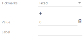
Click
 to add more or
  to delete.
 -
None – no tick marks are set for the X or Y axis.
Tick Format
Set to From Variable to use the format string that is on the current variable displayed in the axis. Set to Metric Prefix to format the Tick labels in the numeric axes using the metric prefixes.
Preferred Tick Space
The preferred space in pixels between the minor grid lines across the axis.
Inverted
Determines whether the Y or Height axis is inverted.
Show Title
Displays an Axis Title label.
When enabled, you can opt to enter a custom Title for the axis which will override the title of the visualization variable.
Axis Bar Thickness
The margin in pixels for the axis. If set to zero, the axis is removed.
Preferred Tick Space
The preferred space in pixels between the minor grid lines across the axis.
Minor Grid Line
How minor grid lines are drawn across the axis. Allowed values:
-
None
-
Dotted
-
Dashed
-
Solid
Major Grid Line
How major grid lines are drawn across the axis. Allowed values:
-
None
-
Dotted
-
Dashed
-
Solid
Range
The visible range for the Left and Right Y-axis variables can either be calculated dynamically (Dynamic Range) or set between predetermined limits by selecting Fixed Range. This enables the Min and Max text boxes and populates them with default values taken from the data set.
Independent Y-Axis Scaling
Determines whether to have each visualization Y-axis in a cross tab automatically scaled independent of the others.
Title and Format From
The title and format of the Left and Right Axes based on the selected fields.
-
(c) 2013-2025 Altair Engineering Inc. All Rights Reserved.