Pie Chart Settings
Pie Charts are one of the oldest and best-known visualizations for displaying contributions to a total.
Panopticon can produce standard Pie Charts in which the pie slice represents a numeric variable that is proportional to the total size of the pie. The color variable can represent either a category or another numeric variable.
Pie Charts can be flat, showing a single set of slices. They can also be hierarchical and display multiple levels of data in a variant called a Multilevel Pie Chart. This is also known as Sun Burst or a Radial Treemap.
The user can modify the visible depth level and drill into slices to investigate further detail.
A recommended alternative to the Pie Chart is the Treemap, which can display a larger number of data points, and it is easier to compare constituent data points.
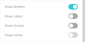
The pie chart settings pane is displayed after clicking the Options  button.
| Setting | Description |
| Show Borders | Determines whether borders are drawn around each pie slice. This is enabled by default. |
| Show Labels | Determines whether labels are displayed within each pie slice. |
| Show Groups | Determines whether a multilevel Pie Chart (or Sun Burst) is displayed, where each hierarchy level is represented in a nested group. |
(c) 2013-2025 Altair Engineering Inc. All Rights Reserved.