Gauge Settings
The Gauge visualization was introduced with release 2024.0. It is used for creating radial gauges (e.g., speedometer style), or linear vertical gauges, or linear horizontal gauges, also known as Bullet Graphs.
Characteristics of gauge visualization in Panopticon are:
- One (or several) gauge variables visualized as a bar reaching some point along the axis
- One (or several) reference marks along the axis, in the form of either a crossbar or a cross
- A color-coded background along the axis, giving indication of good and bad value spans
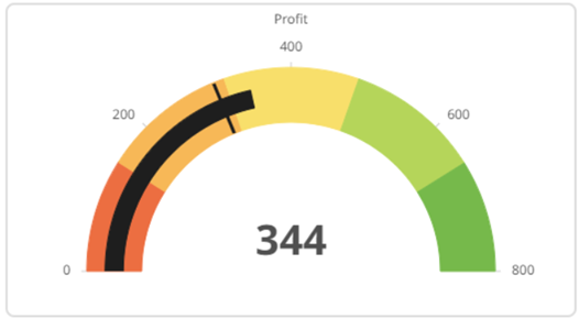
Like a bar graph, a gauge serves the purpose of visualizing a specific value by drawing a bar along an axis. However, the gauge is also different from a plain bar graph and can communicate more information, by having one or several reference value indicators, and by having color scale background. Thereby, the viewer immediately understands if the current value is considered low or high, good, or bad, and how far off from a target or a reference value it is.
Here are some examples of Gauge visualization:


| Settings Pill | Description |
|
Columns |
Cross tabbing a gauge into multiple copies in columns based on one or several text dimensions (data columns of type text). |
|
Rows |
Cross tabbing a gauge into multiple copies in rows based on one or several text dimensions (data columns of type text). |
|
Gauge |
The main setting, where one or several numeric columns are added to create one or several marks of bar, crossbar, or cross. |
|
Label |
For controlling the display of values, numeric or text, in the center area below the gauge band. |
|
Tooltip |
For controlling the content of the tooltip popup that shows when pointing at a mark in the gauge. |
|
Style |
Style settings for the visualization part, including for example, the title rows. |
|
Filters |
For controlling the display of Rank Filters, and application of any other static filter on the visualization. |
|
Options |
Entry of visualization Title text rows and various other settings. |
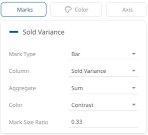
Detailed settings under the Gauge Pill.
By drag-dropping a numeric column on the Gauge pill, a gauge visualization will immediately appear. A number of properties are set automatically. There are three sub-pills with settings:
| Sub-pill Setting | Description |
|
Mark Type |
Bar, Crossbar, or Cross. |
|
Column |
The numeric column to be used. |
|
Aggregate |
The aggregation method to be used for the column. Default is Sum. |
|
Color |
How the mark will be colored: Contrast, General Foreground, or Custom color. |
|
Mark Size Ratio |
The portion of the gauge band thickness that the mark should occupy. |

| Sub-pill Setting | Description |
|
Single Color > Palette |
These settings give a uniform, single color to the gauge bar. |
|
Stepped Colors > Palette |
These settings give a stepped color coding of the gauge bar, using either a 2-color palette (sequential palette) or a 3-color palette (diverging palette). |
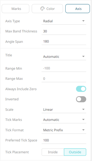
| Sub-pill Setting | Description |
|
Axis Type |
Controls the Gauge type: Radial, Horizontal, or Vertical. |
|
Max Band Thickness |
Sets the maximum thickness of the gauge bar. When the screen space is not enough, the band will be drawn thinner. Default is 30 pixels. |
|
Angle Span (for Radial Axis Type only) |
Sets the angle of the radial gauge. Values 1-360 supported. Default is 180. |
|
Axis Thickness (for Horizontal and Vertical Axis Type only) |
Sets the thickness of the area where axis tick mark labels are showing. |
|
Title |
The title of the numeric axis. Options include the following:
|
|
Title Margin (for Horizontal and Vertical Axis Type only) |
Sets the width of the space where the axis title is showing. |
|
Range Min and Range Max |
The range of the gauge band axis. Automatically set values are showing in gray font, while explicitly set values are shown in black font. |
|
Always Include Zero |
Available only when Marks is NOT set to bar. Controls whether zero should always be included in the automatically selected axis range. Default value is On. |
|
Inverted |
Makes the gauge go from right-to-left instead of from left-to-right, or from top-to-bottom instead of bottom-to-top in the case of Vertical Axis Type. |
|
Scale |
Sets the type of scale to use on the gauge axis. Can be Linear, Power, or Logarithmic. Default is Linear. |
|
Tick Marks |
Controls the number of tick marks to show along the gauge axis. Options are Automatic, Custom, or None. Default is Automatic. |
|
Tick Count |
Available only when Tick Marks is set to Custom. Controls the number of tick marks to show. |
|
Tick Min and Tick Max |
Available only when Tick Marks is set to Custom. Controls the values where tick marks will show. |
|
Tick Format |
Controls the formatting of the tick mark labels. Options are Metric Prefix or Custom. Default is Metric Prefix. |
|
Tick Placement (for Radial Axis Type only) |
Controls where axis tick marks will show. Can be either Inside (below) the gauge bar or Outside (above) the gauge bar. Default is Outside. |
(c) 2013-2025 Altair Engineering Inc. All Rights Reserved.