Creating Density Plots in the Numeric Combination Graph
Sample data used in this section.
| Category | x_var |
| A | 1 |
| A | 1 |
| A | 1 |
| A | 2 |
| A | 3 |
| A | 3 |
| A | 4 |
| A | 4 |
| A | 4 |
| A | 4 |
| B | 1 |
| B | 2 |
| B | 2 |
| B | 2 |
| B | 2 |
| B | 3 |
| B | 3 |
| B | 3 |
| B | 4 |
| B | 4 |
A density plot describes the frequency or count of observations in data for each value along the x-axis. For a data set with several X-variable observation and two or more categories in the data, you create a density plot in the following way:
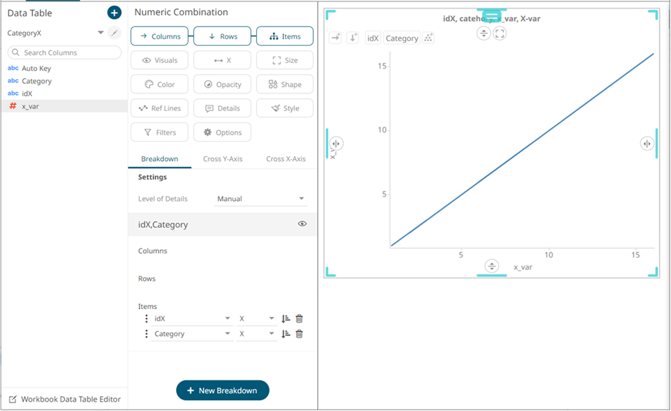
- Put the Category text column on Items, the x-variable on X and the x-variable also on Visuals.
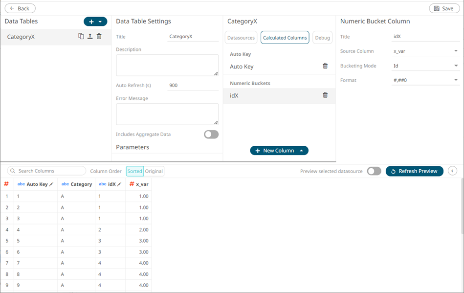
- Create a Numeric Bucket column of typ Id, based on the x-variable column (named idX) and add it to Items, as the top level.
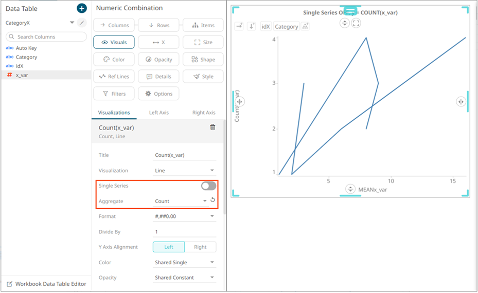
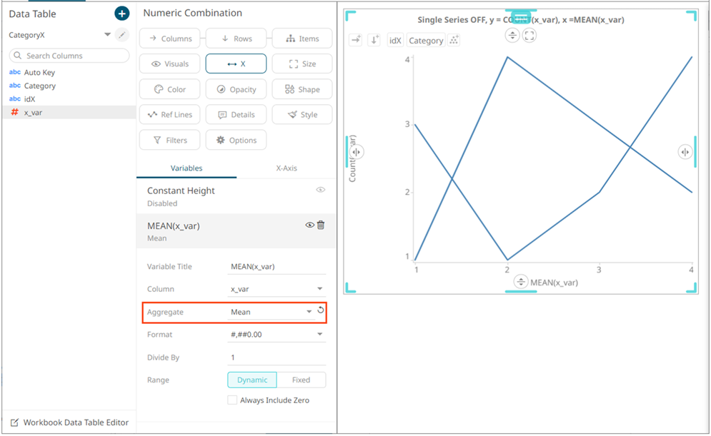
- On the Visuals x-variable column, switch off Single Series, and set Count as aggregation method.
- On the X-axis x-variable columns, set Mean as aggregation method
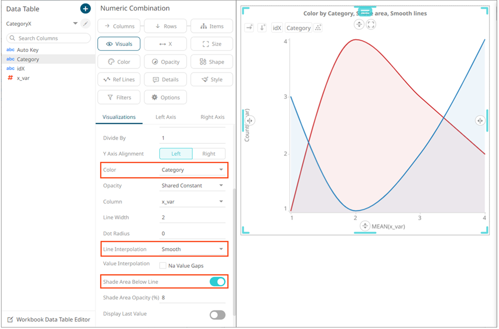
- Optionally, put the category column on Color, and select the category coloring for the Visuals column. Also select Smooth as line interpolation, and switch on Shade Area Below Line.
(c) 2013-2025 Altair Engineering Inc. All Rights Reserved.