


|
Adding an Action Button
The action button control allows users to execute an action. It can also just pass the entered parameter value if the string is exactly equal to the {parameter-name}.
Steps:
1. After double-clicking or drawing a rectangle
on the dashboard canvas, click  on
the Select Part pane then click the Action Button
on
the Select Part pane then click the Action Button  icon.
icon.
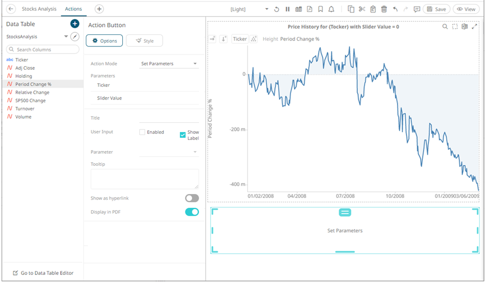
The Action Button pane is displayed, and the Action Button part is added on the dashboard canvas.
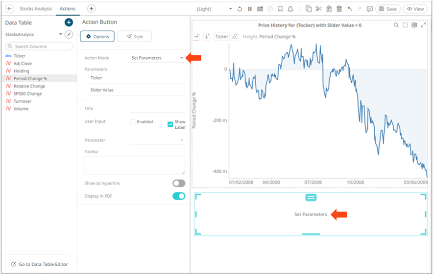
For this example, the following parameters are defined:
|
Parameter Name |
Type |
Default Value |
|
Ticker |
Text |
COST |
|
Slider Value |
Text |
0 |
These parameters are used on the Title of the Line graph (e.g., Price History for {Ticker} with Slider Value = {Slider Value:0.00%}).
2. Select any of the Action Modes:
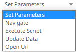
· Set Parameters
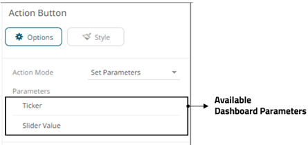
The Parameters pane lists the available parameters to set the data loading for each interaction with the Action Button.
Click on a parameter instance to expand and set the values that the action requires.
· Navigate
Allows the selection of the dashboard where you want to pass the parameters.
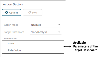
Click on a parameter instance to expand and set the values that the action requires.
· Execute Script
Allows the execution of a script.
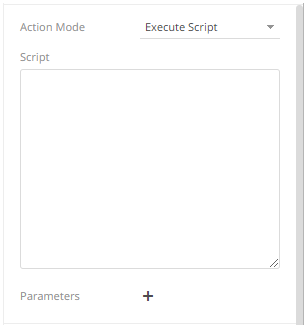
Enter the parameterized Script.
The parameters are written within curly brackets, {ParameterName}.
For script actions allowing multiple value input, you can optionally specify a value separator within the curly brackets where you put the parameter name. The syntax is as follows:
{ParameterName:Separator}
For example: {Company:|}
Default separator is comma. At execution, the parameter will be replaced with real field values associated with the selected visualization node.
You
can opt to add new parameters by clicking  and
define the parameter
values that the action requires.
and
define the parameter
values that the action requires.
· Update Data
Allows data update (typically in a database) by passing parameters into a data query.
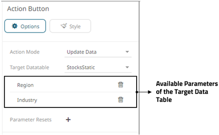
Click
on a parameter instance to expand and set the values that the action
requires. You can also opt to click  to
delete a parameter.
to
delete a parameter.
You
can also opt to specify one or several existing parameters that will
get a new value when the Update Data action is executed. You
can do so by clicking on
the Parameter Resets section.
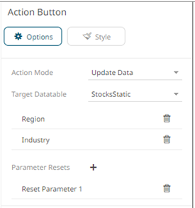
Click on the parameter instance to expand and define its properties.
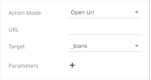
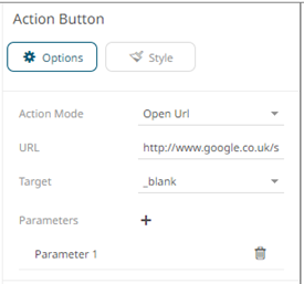
· Open URL
Allows access to a web page or file or even point to other resources on the web such as database queries and command output.
¨ Enter the parameterized URL.
The parameters are written within curly brackets, {ParameterName}.
For actions allowing multiple value input, you can optionally specify a value separator within the curly brackets where you put the parameter name. The syntax is as follows:
{ParameterName:Separator}
For example: {Company:+}
Default separator is semicolon. Specifying for example a plus sign allows you to do multi search term searches on Google, for example.
At execution, the parameter will be replaced with real field values associated with the selected visualization node.
The easiest way to create parameterized URLs is to open an example web page and copy the URL. As an example, Yahoo Finance Key Statistics for Microsoft has the following web address:
http://finance.yahoo.com/q/ks?s=MSFT
If a parameter called Ticker has been set up in the data table, you can generate the URL by removing MSFT and replacing it with {Ticker}:
http://finance.yahoo.com/q/ks?s={Ticker}
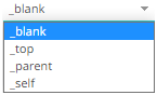
¨ Select the Target area of the page where the output URL will be displayed.
¨ Click to
add parameters to the output URL.
Click on the parameter instance to expand and define its properties.
The title of the action button defaults to the selected action mode.
3. Enter the new Title of the action button.
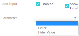
4. For the User Input, you can:
· check the Enabled User Input box to allow the entry of parameter value that will be executed once the action button is clicked.
Then, select the parameter.
This will be displayed on the dashboard as:

· check the Show Label box to display the label (selected by default).
When unchecked, the parameter name is not displayed before the input field.

5. Enter a description or useful information about the action button into the Tooltip box.
6. Tap the Show as Hyperlink slider to turn it on and display the layout style of the button to a hyperlink.
7. Tap the Display in PDF slider to turn it on and include the action button in the output PDF.
8. To set the style of the Action Button,
click Style  .
.
The page updates to display the Style pane.
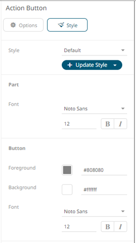
9. Set the Font type, size, style (Bold and/or Italic) of the part and button.
10. Click the Foreground or Background box to display the Color dialog and set the color or enter the Hex color code.
11. Click Update Style 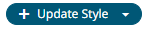 and
select any of the following options:
and
select any of the following options:
· Set current as default – Save the changes and set it as the default.
· Create custom style – Save the changes and set it as a custom style.
The Style pane updates to display the Title control.
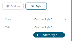
¨ Enter the custom style Title.
¨ If there are additional changes made, click Update Current Style in the Update Style drop-down.
The new custom style is added in the Workbook > Theme > Custom Styles list.
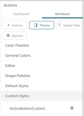
If published, the custom style configuration of the Action Button will be added to the Global custom styles list and can be applied to other parts.
· Reset to default – Revert to the original default settings.
12. Click the Save  icon
on the toolbar to save the changes.
icon
on the toolbar to save the changes.
When
saved, the  notification is displayed.