


|
Adding an Action Text Box
The Action Text Box allows your users to submit free-text input values for a parameter associated with the action part. It can also be used for entering password parameters.
The currently applied parameter value will be displayed in the action text box.
Steps:
1. After double-clicking or drawing a rectangle
on the dashboard canvas, click  on the Select Part
pane then click the Action Text Box
on the Select Part
pane then click the Action Text Box  icon.
icon.
The Action Text Box pane is displayed, and the Action Text Box part is added on the dashboard canvas.
For this example, the following parameters are defined:
|
Parameter Name |
Type |
Default Value |
|
Ticker |
Text |
COST |
|
Slider Value |
Text |
0 |
These parameters are used on the Title of the Line graph (e.g., Price History for {Ticker} with Slider Value = {Slider Value:0.00%}).
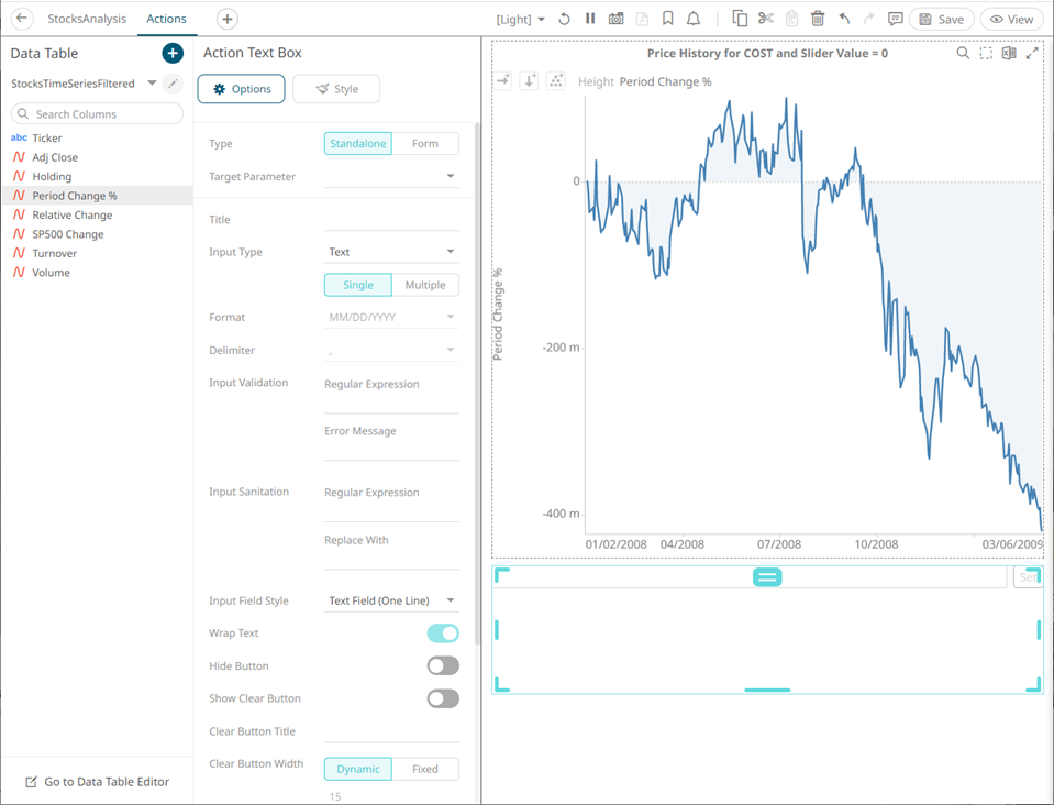
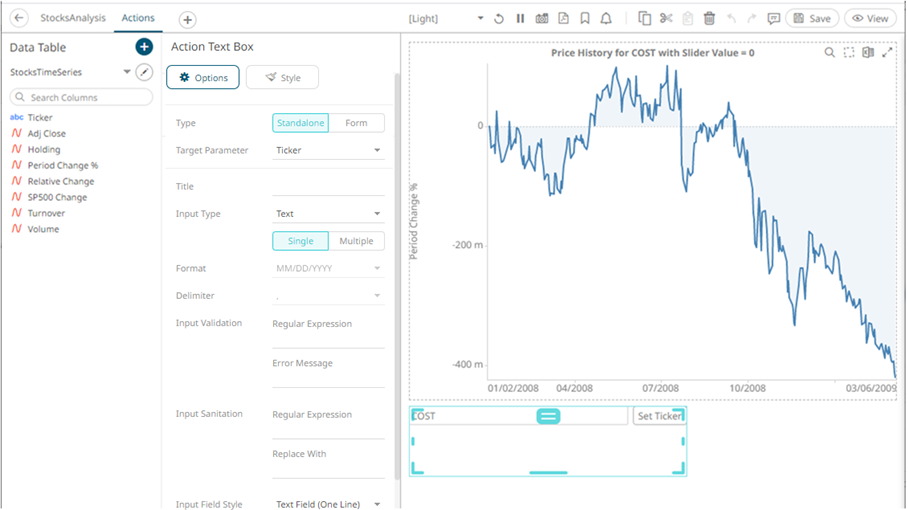
2. The action text box can be configured to either be a Standalone or a Form component.
When set to Form, the action text box can be connected to any form controller on the same dashboard. The parameters that the action part can set depends on how the form is configured.
|
NOTE |
An action form part must be defined first to associate the action text box as a component. Refer to Adding an Action Form more information. |
A line connects the component to the associated form. By default, the Show Title slider is turned on and the title is displayed to describe what parameter the text box is setting (e.g., Set Ticker). Tap to slider to turn it off.
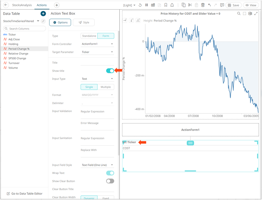
If the action text box should not be connected to a form, it can be set to Standalone instead. Select the Target Parameter that will be updated by this action part.
3. Enter the Title of the text box.
If set to the Standalone type and the Title is blank, the button will be Set <Target Parameter>.
4. Select the Input Type: Text, Numeric, or Time.
If Time is selected, the Format field is enabled. Select the Date/Time format.
5. Select the Input Value Type: Single or Multiple.
If the Input Value Type selected is Multiple, you can opt to select e Delimiter character:
6. Add a custom Input Validation:
· Enter a Regular Expression to match the input data.
· The parameter will not be updated unless it passes the validation. Enter an Error Message to help in defining a better input in the Action Text Box.
7. Set the Input Sanitation:
· Enter a Regular Expression to match the input data.
· Enter a Replace Value which is the value to replace all matches from the regex with.
Whenever changing the text inside the action text box, this sanitation will be applied to whatever value is entered.
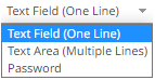
8. Select the Input Field Style: Text Field (One Line), Text Area (Multiple Lines), or Password.
9. Tap the Wrap Text slider (applies to Text Area).
10. Tap the Hide Button slider for the action control to update the parameter whenever the value of the text box changes.
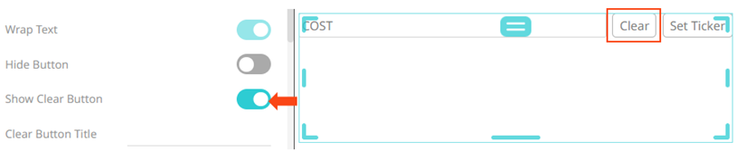
11. Tap the Show Clear Button slider to display a button that will clear the text box when clicked.
12. Enter the Clear Button Title, if required.
13. Set the Clear Button Width. The value can either be calculated dynamically (default is Dynamic) or set to a fixed value (Fixed).
14. Set the Button Width. The value can either be calculated dynamically (default is Dynamic) or set to a fixed value (Fixed).
15. Tap the Display in PDF slider to turn it on and include the action button in the output PDF.
16. Enter a description or useful information about the action text box into the Tooltip box.
17. To set the style of the Action Text
Box, click Style  .
.
The page updates to display the Style pane.
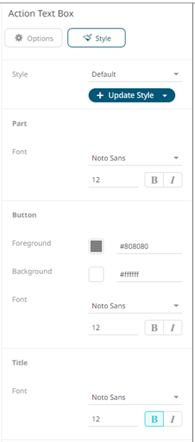
18. Set the Font type, size, style (Bold and/or Italic) of the part, button, and title.
The title’s font is set to Bold by default.
19. Click the Foreground or Background box to display the Color dialog and set the button’s color or enter the Hex color code.
20. Click Update Style  and select any of the following
options:
and select any of the following
options:
· Set current as default – Save the changes and set it as the default.
· Create custom style – Save the changes and set it as a custom style.
The Style pane updates to display the Title control.
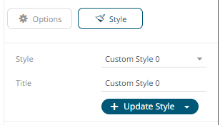
¨ Enter the custom style Title.
¨ If there are additional changes made, click Update Current Style in the Update Style drop-down.
The new custom style is added in the Workbook > Theme > Custom Styles list.
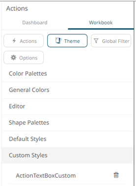
If published, the custom style configuration of the Action Text Box will be added to the Global custom styles list and can be applied to other parts.
· Reset to default – Revert to the original default settings.
21. Click the Save  icon
on the toolbar to save the changes.
icon
on the toolbar to save the changes.
When
saved, the  notification
is displayed.
notification
is displayed.